
Most people imagine an artist as being free spirited and creative all the time. But you can’t neglect all of the business side, if you want to be successful at what you do. And a part of that is marketing and generating enough exposure to get the right client’s eyes on your work.
That’s why most artists have a website. But often they don’t give it the business treatment it deserves. There are common mistakes, which I see again and again, even though they can be avoided easily. Make sure you are not guilty of any of these yourself, because you might hurt your engagement and conversion rate.
Let’s talk about these mistakes, why they are a problem for your website, and how to fix them:
1. Using Too Little or No Text
The Problem
The lack of text means a lack of keywords, which impacts your SEO (search engine optimization) negatively. This makes it less likely for interested parties to find your site. If they make it to your site, but you still use text sparingly, you limit your work’s context and can leave visitors confused or guessing.
The Fix
Text is your place to shine to tell visitors all about your work, why you created it, and which products you are aiming for. Storytelling is your best friend, as it creates an emotional connection, which draws in potential clients even more. When talking about your art, make sure to use descriptive keywords and provide ample context.
2. No Alt-Text for Images
The Problem
Surface design is a visual art style, which makes it impossible for search engines to understand, because it can only analyze text. Without alt-text you decrease your SEO ranking, because your images are not indexed.
If a client searches for what you have to offer, you might not even show up in their results. But alt-text isn’t just for SEO. It’s also an accessibility tool. Not having any alt-text excludes visually impaired visitors who rely on screen readers for context.

The Fix
Use descriptive alt-text to describe your artwork in detail. Make sure to use full sentences and stay away from keyword stuffing, which is the practice of overloading with an excessive number of keywords, as it leads to a poor user experience. Always think about the actual people visiting your website who need this feature for disability reasons and don’t just cater to a machine.
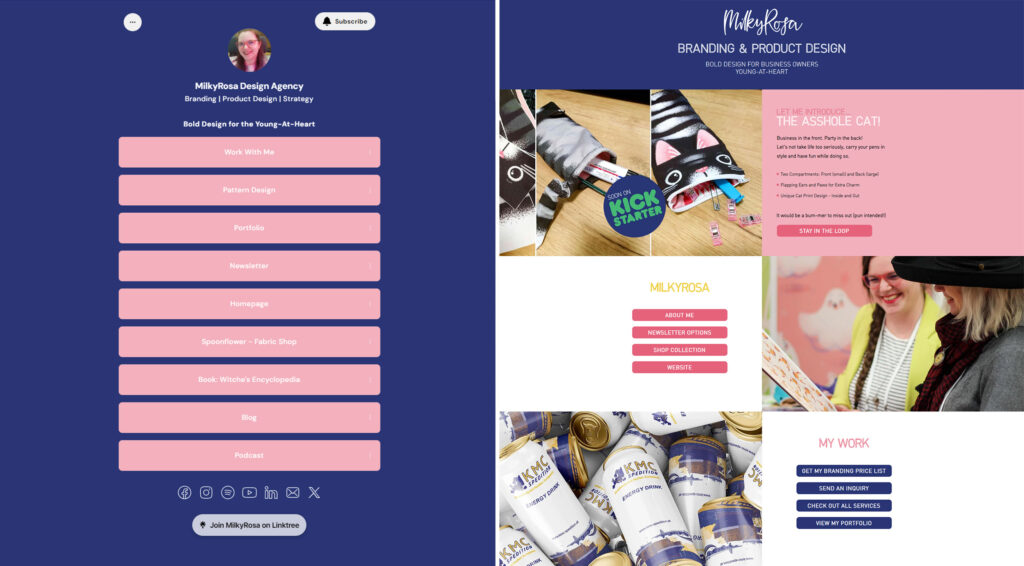
3. Using an External Link Site
The Problem
The end goal for all your online sites is to get visitors to your own website. Especially on social media, you want to make it easy for people to access current information, but you only get the chance to share one link.
Using an external provider like Linktree might sound like the perfect option at first, but it diverts traffic away from your own website. As this is a third-party feature, you don’t own it and only have limited customization options available.
The Fix
You can still create the same and even better experience by creating your own custom link-page on your website. This means you get more traffic to your website and boost your site’s SEO in the process.
You can also customize to your heart’s content and update it whenever you want to advertise anything new. You can share images and videos within your usual website layout and brand design. This wouldn’t be possible on an externally provided link-page.
4. Boring Header Text
The Problem
The top part of your website (commonly referred to as “above the fold”), like the header image and text, are your first impression. As users spend 57% of their time above the fold, anything you show here makes them decide to leave or stay.
Don’t waste it for a “Hi, nice to meet you,” as this will fail to capture their interest. By not telling them what you have to offer, they’ll leave again in a split second. No one wants to read through paragraphs of text, only to find out that you are not offering what they are looking for.
The Fix
Show your visitors what they get — not what you do. They are more interested in the result than the path to get there. Instead of “Surface Designer for Apparel” use “Bold Designs for Headstrong Teens.” It’s all about story building and conveying emotion!
A strong header line will instantly connect with your people, weed out unfitting visitors, and retain the ones that are a perfect match.
Related Article: Artist Website Basics:
What You Need & What You Don’t
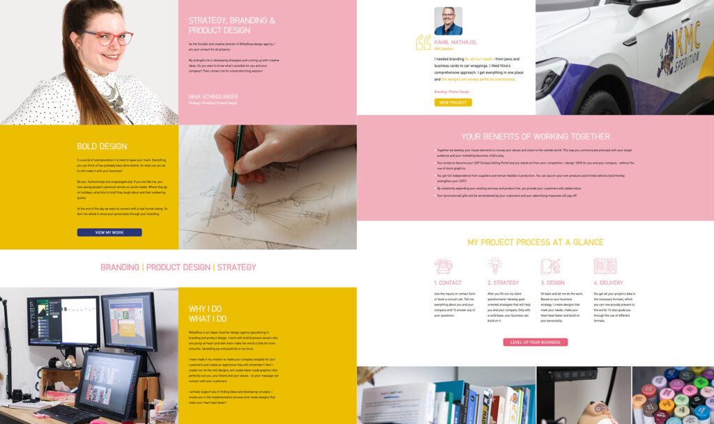
5. No “About Me” Page
The Problem
One of your most important tools is the “About Me” page. If you already have one, check your Google Analytics and see for yourself! It’s because we are looking for human connection, which couldn’t be more true when working with artists.
Your work is personal, so understandably clients would like to find out more about you. By not including any info or photos of yourself, you are missing the opportunity of making real, personal connections. It also makes you look less professional and lose credibility with your audience.
The Fix
Make sure to talk about your unique story and show off your personality — because there is no one else like you out there! In many cases, clients choose character and sympathy over skills and price, as getting along well means a lot to many while working on a project.
Don’t be afraid of giving a glimpse into your world and include a professional photo of yourself, what you do, why you do it, and client testimonials. Your “About Me” page is less about you and more about your visitors. They need to know what they get from working with you. So including insights from your client’s perspective will increase your conversion rate.
6. No Business Treatment
The Problem
You might think that having your portfolio on your website is the one and only thing you need. But truth be told, if you ignore any business-related aspects, you might miss out on future project deals. Not conveying the value and service offered might leave potential clients confused or overwhelmed, which means they’ll rather leave your website than engage with you.
The Fix
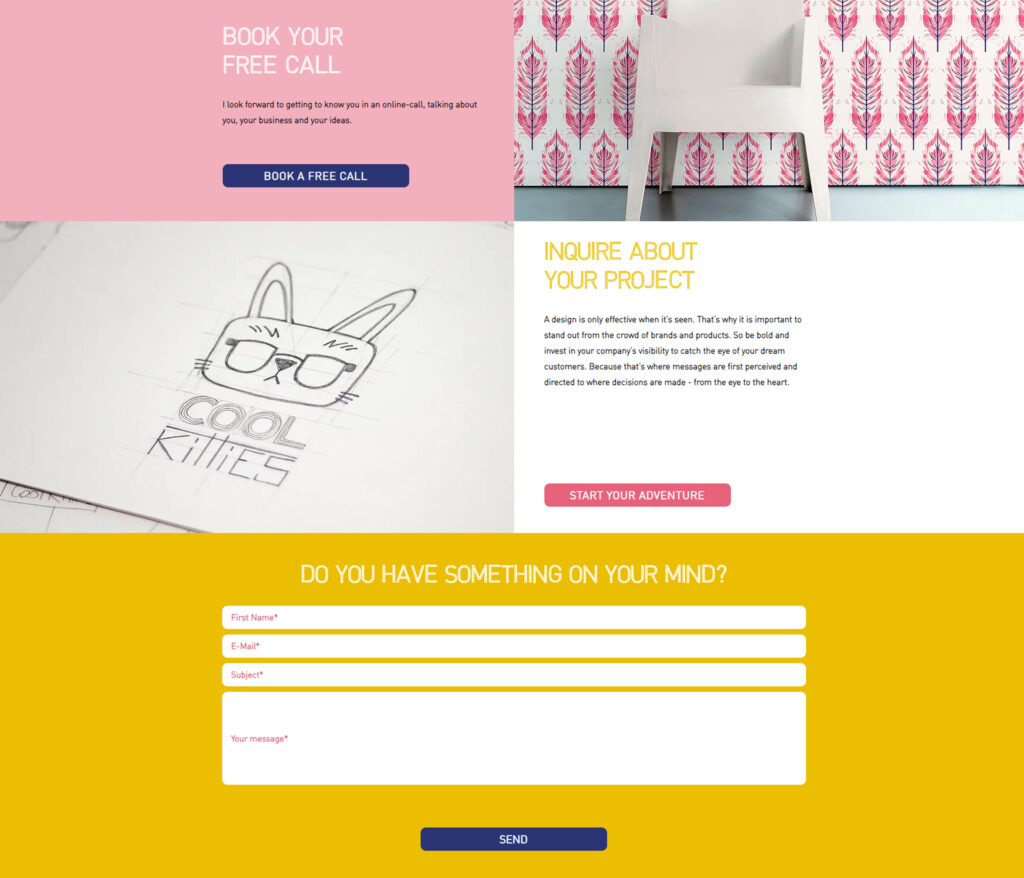
You need to include your services, what you have to offer, your USP (unique selling point), and what the client gets from working with you. You need to address their pain points, as they’ll be searching for their problems, rather than the solution to said issues. This way they feel confident when reaching out to you, as they already know that you are a suitable candidate for the job.
Make sure to include a contact page with an online form, your email address, and links to your social media sites. The more opportunities you offer them for making contact, the more likely they’ll find one that suits them best.
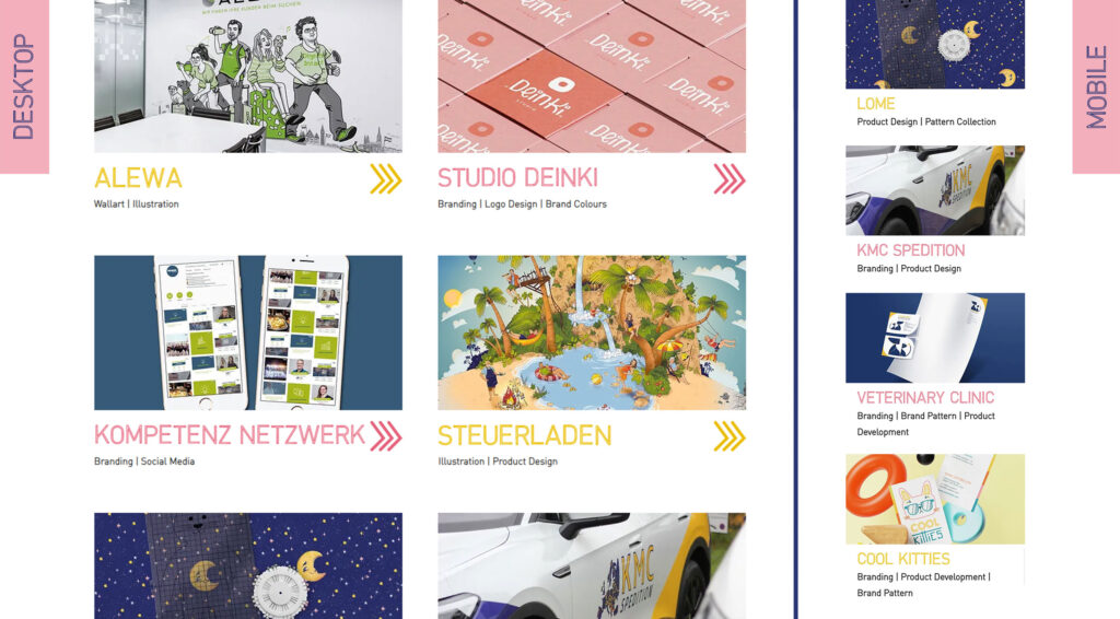
7. No Clear Design Line
The Problem
Design isn’t just important when it comes to your artwork, but for your brand as well. 94% of your first impression comes down to design and 90% of visitors will leave if your site is poorly designed. So by having bad or unintentional design, you might push people away or they might not recognize you again, because your website looks totally different from your social media presence.
The Fix
Setting up a cohesive visual identity consisting of colors, fonts, and other assets is essential for your business to be recognizable across platforms. It will also make life easier for you, because you are no longer starting from scratch when designing for yourself.
To not overload your visitors, use plenty of white space (the empty space surrounding elements like text or images) as it will help immensely. You will look more professional and high-end and enhance readability and aesthetic appeal overall.
8. No Website Optimization
The Problem
Not optimizing your images for the web will result in longer loading times and a poor experience on mobile devices. Most visitors will get frustrated and leave right away. 47% of them will do so after a mere two seconds!
You are essentially missing out on showing your skills and services, as visitors leave before you get the chance to. In North America alone, 45% of visitors use mobile devices to browse the web. And in 2023, 54% of all web traffic came through mobile phones. Make sure you keep this in mind to avoid scaring any visitors away.
The Fix
First off, you should optimize your images for the web, which will increase your loading times. It’s best to save your pictures in 72dpi and keep the size under 500KB, if possible.
When it comes to mobile, you have to ensure your site uses responsive design. This means elements will scale up and down and move positions, depending on the user’s device. This will guarantee a smooth experience for visitors, who will stay longer, engage more with your site, and hopefully reach out to you in the end.
9. Not Using Any Call to Actions
The Problem
Did you know that seven out of 10 small businesses still don’t use any CTAs (call to actions)? Make sure you are not one of them, because without guiding your visitors through your website, they’ll most likely leave before you can convert them to loyal customers.
If you already use CTAs, you might want to check their wording too, as basic phrases like “buy now” or “read more” might hurt you more than they help you.
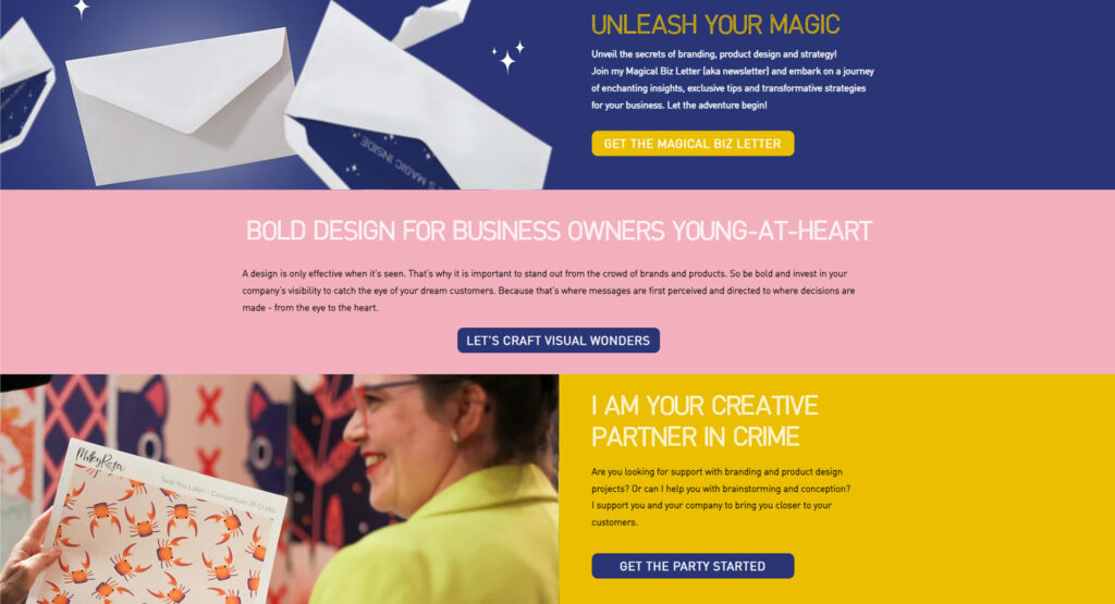
The Fix
CTAs are essential to steer visitors towards where you want them to go, might it be your portfolio or contact form. Each button triggers an action, which you have to be in charge of.
This will allow easy browsing through your website and visitors will stay longer, which makes them more likely to interact with you. Include clear CTAs with a bit of personal flavor to get the most out of them.
10. No Personality
The Problem
Looking like one of many might be your biggest problem out there. As soon as you step into an oversaturated field, it becomes more and more necessary to stand out. Appearing generic and impersonal might not grab a client’s attention, which results in missed leads.
The Fix
Your website is supposed to have some “flavor.” Don’t shy away from showing your personality through text, photos, or colors. There is no one way that’s right for any of these. Are you the type who wants to attract analytically thinking business-people or would you rather work with family-run mom-and-pop shops?
Tailor your assets to attract the client you want to work with the most. To find your people, you can share personal details, quirks, and your opinions. That’s why authentic photographs are so important — so stay away from uninspired and impersonal stock photos! Differentiate yourself from other artists, because there is only one YOU!
By following these guidelines, you can have a website that’s not just visually appealing, but also effective in driving traffic and converting leads.
Additionally, you should regularly check up on your site’s analytics, to see what’s already working and pinpoint areas to improve. It will help you understand your visitor’s behavior and adjust accordingly. You also want to keep your content up-to-date and relevant, to improve your SEO rating and encourage visitors to come back for more.
Website Statistics Sources: Forbes & Sixth City Marketing

Written by Nina Schindlinger
Website: www.milkyrosa.com
Instagram: @milkyrosadesignagency
Class: Create Your First Product
Nina is the founder and creative director of MilkyRosa Design Agency. She specialises in branding and product design for companies that are young at heart. Her design style is bold, playful and charming, which she uses for her own line of products to make the world a fun and colourful place.


