There are a lot of myths about the business of surface design that many of us fall victim to…
My portfolio is too small.
There’s too much competition in the industry.
I need permission to contact art directors.
All of those statements above are totally untrue, yet I hear things like this being said constantly and the sad truth is beliefs like this can really hold you back from realizing your dreams of a thriving surface design business.

But there’s about another, bigger myth, that’s even more damaging than all of these. And it’s…
I have to create a lot of art to earn good money.
There’s a version of this myth in practically every industry on the planet. You may recognize it better as: working hard = success. And we’ve all been told this throughout our lives:
-
Study hard in school and you’ll get an A
-
Practice harder and longer and you’ll be a better athlete
-
Go above and beyond at work and you’ll get a promotion
But if you think about it, how could that possible be true? If ALL it took to be successful was to work harder and produce more, we’d all be successful and every surface designer who has a large portfolio would be rolling in the dough!
Yet the reality is many surface designers – yes even those that post art daily to Instagram – aren’t making any money!
So if focusing all your efforts on producing more portfolio designs isn’t the answer, what is? Well, the answer actually has 2 parts.
-
Add to your portfolio strategically.
-
Do more marketing.
Today, I’m discussing part one, and then we’ll dive into part two next time.
Adding Art to Your Portfolio Strategically
It’s not about HOW much artwork you add to your portfolio as much as adding in the RIGHT artwork – designs that help make it stronger and allow you to license more of it. But how do you know what the “right artwork” is for you?
The answer is with a portfolio audit. What the heck is that?
A portfolio audit is doing an evaluation of your work as a whole to help you identify both strengths and gaps in your portfolio.
And the reason this is so important is that once you know what your portfolio has (and doesn’t have), you’ll know what designs you need to create next to make it more well-rounded and sellable.
Step 1: Count how many total designs you have.
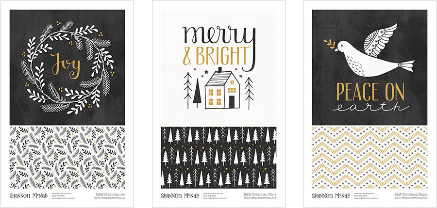
I like to define “design” by each sheet of my portfolio which usually contains a hero image with an option of 1-2 coordinates. And yes, if I have larger collections, I still break them up like this onto multiple sheets (see below). Each sheet would count as one design, so for the example below I’d count this 1 collection as 3 designs.

And this collection was licensed to Chalk Couture for the 2019 Christmas season and I was compensated for EACH design – that’s why breaking up large collections is important – it can possibly mean more $$$ than selling all together on one page!
Step 2: Count your categories & formats
You have the full picture now of your total count, so now it’s time to group your portfolio into different categories and count how many designs you have in each. I’d suggest you have at least have 3 categories: floral, Christmas, and other (as florals and Christmas are asked for more frequently than anything else).*
But if you’re looking to add in a few more, here’s a list of common categories:
- Florals
- Christmas
- Animals
- Baby
- Food & Drink
- Geometrics
- Greetings
- Seasonal
- Travel & Transportation
- Everyday/Conversational
Now, this list may not cover absolutely everything in your portfolio, so if you want to include something else, go for it!
What categories you choose is up to you and your art.
Then after you’ve grouped and counted your categories, go back and look at each design’s format. Count how many designs are pattern-based versus illustration and lettering-based.
*There is an exception to this rule! If your work is very niche (like high-end home decor type art) and you aren’t interested in getting general market clients, then you don’t HAVE to add in Christmas art. Again it really all comes down to what you like to create and what products you see your art on.
Step 3: Look for Gaps
Now as you review the counts of your categories and formats, look to see if there are any areas of your portfolio that are lacking.
Maybe you have all patterns, but want your art on greeting cards…
Create some illustration pieces.
Or you have 3 florals and 1 animal design, but 20 Christmas…
Design several new florals & few animal pieces.
This is the most crucial part of the portfolio audit, so don’t skip it! Because if you can identify 2-3 gaps in your portfolio and then move forward designing new work that fills those spaces, you’ll have created a more well-rounded portfolio.
Want my entire portfolio-building process?
Join our Portfolio Masterclass where I give you a simple, but effective framework to help you build a portfolio that will make it easier to get your art licensed.
P.S. You can read part 2 of this series here, where I talk about one of the scariest words for artists: marketing. But don’t worry, I make it fun!
I tried to get your portfolio audit pdf and it doesn’t do anything. I love the info you provide and I am signed up to be notified when your course is available! I can’t wait!
Hi Samantha! Sorry you’re having trouble downloading the worksheet. I just tested the link and it is working – do you have pop-ups disabled? If so, that might be the issue.
But we’d be happy to send it to you as well. Just email us at hello@sketchdesignrepeat.com and we’ll get you sorted!
Hi there, I am currently designing my first licensing portfolio and I am wondering if I should include the different colorways for each collection, and if I should include the colorways of one-off patterns. Thanks! Love your teaching!
Hi Noemi! Multiple colorways aren’t necessary for most markets, so don’t feel like you have to create them for all your collections. As for one-off patterns, I sometimes like to include a 2nd colorway on my portfolio sheet to help show it’s full potential 🙂