
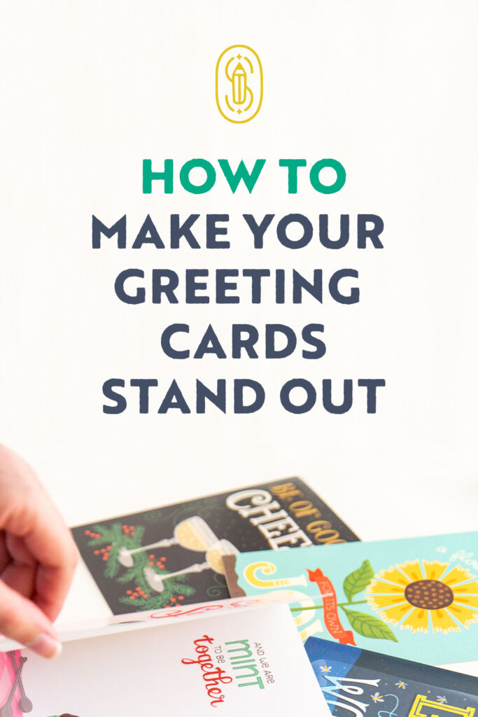
I used to love making handmade greeting cards for friends and family when I was a kid, back in 2012. However, today, to earn a living in the outside world by creating beautiful and catchy designs, I needed to learn a few things that would pique the interest of buyers and make customers happy!
Follow along with these 7 tips for creating a card that will spark people’s interest.
1. Choose quirky copy
What is copy? Simply put, they are just words or the main message that your card will convey. The most common ones you may have seen or even received might be: Happy Birthday, Happy Halloween, or a good old Merry Christmas.
While these phrases are considered classic and can never go out of style, you may want to try spending some extra time coming up with words that look and feel a bit different…
- Try using rhyming words. Jot down a list of words that pertain to the occasion you’re designing for.
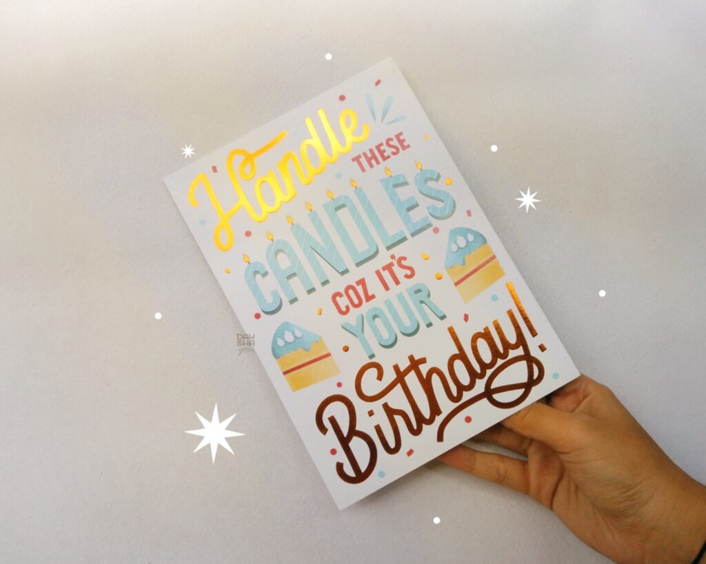
- Take Birthday for instance. Some common words I can think of are cake, candles, gifts, party, celebrate, and age.
- Next, pick one or two words that you can find a rhyme for. I have a card that has already been licensed with the word ‘candles’ in it, and the phrase I came up with was ‘Handle these candles coz it’s your birthday!’ Doesn’t that sound more fun than just Happy Birthday?
Of course, your phrases don’t always need to be wordy or long, but coming up with quirky copy can give you space to experiment with lettering layouts and illustration styles that beat the usual.
When presented to clients, it shows your capability of coming up with your own ideas. Original ideas along with good design will likely help you get them sold!
2. Be mindful of technicalities
Once you have a great idea that tickles your hands to create, you need to prepare a proper canvas for it. By technicalities, I mean things like canvas size (in various means of measurement like pixels, inches, and cm), DPI/PPI (dots per inch/ pixels per inch), and color mode (RGB/CMYK).
If you’re designing for a client, these aspects will always be outlined for you, or if you’re designing for your own business and printing them at home, you can set your guidelines! However, if you’re making newer designs for your portfolio or potentially selling it, you might want to be a bit mindful:
- Always design a card that is at least 300 DPI/PPI (if it’s more than 300, even better).
- The most common card size is 5″ x 7″ so avoid making canvases smaller than that.
- A go-to hack is to always design on a bigger canvas so that you can resize it if need be.
- Most cards get printed and hence need to be in the CMYK profile, however, some companies take RGB format as well. Take these as a starting point and you can always adjust accordingly!
3. Design wisely according to orientation
There are two types of orientation, horizontal and vertical. The majority of greeting cards are vertically designed, but there are some horizontal ones too. Whichever one you choose, make sure that the top portion of the artwork has an enticing design that gives away the feel of the card as it’s what a customer is most likely to see when shopping.
Imagine dividing your artwork into three parts, and make the top third part have important details. That doesn’t mean you compromise the rest of the artwork! My reason for mentioning the former idea is to help you design a card as if it were to sell in stores. Have you ever seen cards lined up on shelves in a shop? We don’t usually see the bottom half of it, hence make the top portion count!

One good way to do this is to avoid having your art center-heavy or leaving the top portion blank. This rule isn’t set in stone if you are selling cards for a website that displays the artwork entirely, however, it’s a tip to consider if your card will make it into stores.
An exception would be square cards. Not widely seen but it’s something you shouldn’t neglect. Since squares are balanced on all sides, you can divide the card into two halves and design accordingly.
4. Balance your lettering & illustration
An average greeting card includes both lettering/typography and illustration. Once your canvas and orientation are set, you can finally think of how to properly lay out your copy. A good card usually has both letters and illustrative elements balanced out. Balance doesn’t always mean equality, since your art direction can be different in various situations.
Let’s stick to designing a Birthday card for example. If your copy is text-heavy, you might want to fill in extra negative spaces in your layout with little stars or confetti. However, if your copy has 2–4 words, you might want to create a bigger illustration to fill the gap, or put your copy inside a birthday cake!
Related Class: Hand Lettering for Surface Designers
The key takeaway here is to give visual balance. Think of what you want the viewer to first lay their eyes on and how you can experimentally balance the design.
For the same birthday card, you might want to make the cake illustration more prominent than the confetti, or the word ‘birthday’ bolder than ‘to you,’ right? Again, this depends on your work, and these ideas may not always apply because we are unique artists with unique card ideas!
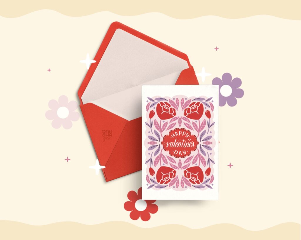
5. Maintain a limited color palette
After your final sketch is done, it’s time to complete your card by adding color. In order for your card to look and feel cohesive, a limited color palette is highly recommended.
Stick to a minimum of 3 colors and a maximum of 5 colors for your card, or in fact, for any art you create. More colors and an uneven color palette can make the piece look too stimulating, just as fewer colors can make the piece look boring.
The viewer’s eyes should not get lost trying to decipher the colors instead of looking at the card design overall. Don’t choose colors that don’t resonate with the theme of the card, for example: choosing black and orange for Valentine’s Day!
For the times when I feel confused as to what colors I should pick, I scroll down Pinterest or look at cards that are of the same occasion as mine. If I really love the colors of the inspiration card, I create a similar palette and it almost always works!
6. Use mockups for better presentation
Now that your greeting card design is ready, you either need to send the files to your client, upload them on your preferred print-on-demand website, or have them printed out for you to sell to your customers.
If you belong to the last category, there’s usually nothing to worry about when it comes to sharing your card with the world on your social media, because you can take a picture of your tangible card! But for the first two scenarios, you may not have your card on hand right away, and impatience may surface (totally normal) because of course you want to show your work to others, right?
Here’s where mock-ups can be helpful.
All you need to do is find a mock-up online that shows off your card (there are loads of paid and free ones), place your design on the mockup with a few adjustments, and be done! You can now share your card right away.
To personalize my mock-up a little more, I add my logo, company logo (if it’s client work), and some sparkles or elements according to the card design.
Mock-ups can be beneficial in two ways. First is what we discussed earlier — it lets you share your design right away! Secondly, it can help you, your current client, or your potential client to visualize how your art may look in real life as a greeting card. It’s a win-win!
But keep in mind one thing, don’t overuse mock-ups on your portfolio or social media. Try adding some variety as to how you can use them in moderation!
Related Article: Surface Design Trends: Developing Your Own
Idea Library
7. Don’t overthink it (seriously!)
You may already know that rules cannot be always followed and we do enjoy breaking them now and then, artistically speaking. Like all rules, some can be bent, others, not really! In all these six points, I outlined my process on how I design cards which has helped me stand out and earn clients. However, it isn’t possible to always stick to one particular way of doing things, right?
There are many ways I don’t take things seriously, here’s how:
- My brainstorming game for coming up with cool copy isn’t always strong. For those times, I searched for other card inspirations online and used their message and made it my own (unless they have it copyrighted). You can also just use the classic phrases if you can’t think of anything as a “Happy Holidays” or “Giving Thanks” card is still a valuable addition to your card lineup.
- The card you spend the most time working on may not sell at all OR the card you made in 20 minutes makes the most sales! You may get your worth for your hard work, but at times, it doesn’t pay off. The best way to deal with this is to have a good relationship with your art. I’ve outlined this idea better in an article where I discussed using Instagram with purpose.

So, there you have it — my entire experience creating greeting cards. I hope it gives you some courage to begin or continue your path!
Due to the low number of people that buy, mail, or even receive greeting cards, they may feel a little dated to some. But as a creator, I want to keep greeting cards around. Think about what you want the buyer, and most importantly the receiver, to feel when they hold the card in their hands and see your design! That will easily put you in the right mindset before you sit down to create one.
Lastly, don’t forget to experiment, fail, and get back up again! If need be, I’m here to help. Come back to this blog (or message me) if you’re feeling stuck. Happy card-making!

Written by Daksha Giri
Website: www.dakshagiri.com
Instagram: @dakshagiri
Daksha Giri is an illustrator and lettering artist based in India who creates beautiful and unique artwork that is both visually appealing and emotionally resonant. Her work is seen in greeting cards, packaging, giftware & home décor.


Really helpful and confirmed some elements for me whilst pointing out things I hadn’t thought of.
Thankyou
I’m so happy to know that my blog helped you!