
I love color, but it was always a headache choosing them for my designs — especially when working digitally — because the sheer amount of possiblities is simply overwhelming!
I also didn’t like that my portfolio didn’t look as cohesive as I wanted it to. It felt like I was winging it every time, and to me, it seemed like hit or miss if it would turn out the way I imagined.
That’s when I sat down to work out my own color palette, which makes picking colors way easier now. On top of making my life easier, it has also made my client’s lives easier too.
3 reasons it’s good to have a color palette
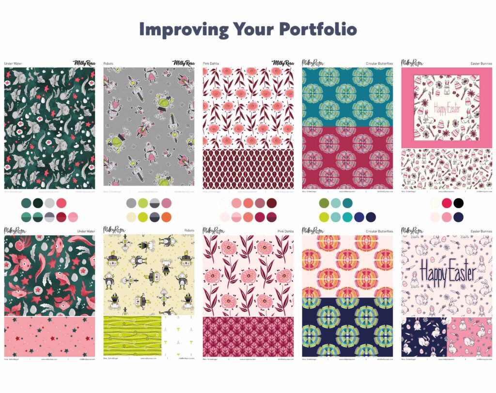
- It strengthens your portfolio by making it more cohesive and therefore showing a stronger sense of style through your color choices.
- It enhances your personality and reduces uncertainty and insecurity on your end, because you work with a predetermined color range, which you have strategically curated to your own needs.
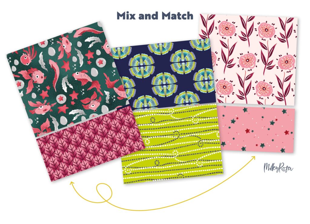
- You and your clients can mix and match designs from different collections and the colors still work together nicely. This makes life a lot easier for you and future clients.
Who should use a color palette?
I’d recommend using a distinct color palette to any designer who has been creating for a while. Using a set palette will make sure your style looks cohesive and is recognized as your own “handwriting.” With everything that has to do with style, it will come over time and can’t be forced just because you want to at a certain moment.
If you are just starting out as a designer, I’d recommend not limiting yourself to anything. Not in color, media, or style. It’s important to experiment as you learn the ins and outs of surface design and while you are creating you realize what you enjoy, what comes easiest to you, and what you want your designs to look and feel like.
The same is true for color. So make sure you have a well-rounded body of work ready to analyze BEFORE you create your own color palette.
How many colors should you include in your color palette?
I don’t have a set amount of colors for you. I prefer to have as little as possible, while still having a palette that gives me enough wiggle room to pick and choose from a variety of options.
If you use too little, your work might start to look too similar from piece to piece. But if you use too many, you will dilute your style and therefore not get the benefit of a curated color palette, which you wanted in the first place!
I currently have 66 colors on my color sheet as I’m a very colorful person when it comes to my artwork.
Maybe fewer colors work for you. I’d say you give it a try and see how it feels. Also, just because you start out with a smaller or larger amount doesn’t mean you can’t tweak your color sheet in the future.
I had a situation where I needed a variation of browns but didn’t include any in my first color palette draft. Brown isn’t a color I typically use often, so I didn’t need it back then. Whenever I need a certain color that can’t be exchanged for one that’s already on my sheet, I’ll use a new one and add it to the mix — if needed often enough.
Related Article: Surface Design Trends:
Developing Your Own Idea Library
How to create your own color swatch palette
I’ve mentioned before that you have to have a good amount of work ready to analyze. Of course, there’s other methods you could use, but this one assures you are adding colors to your palette that you already use naturally and without any external influence.
I’d suggest you do these next steps digitally, even if you work traditionally. It will be a lot easier, I promise!
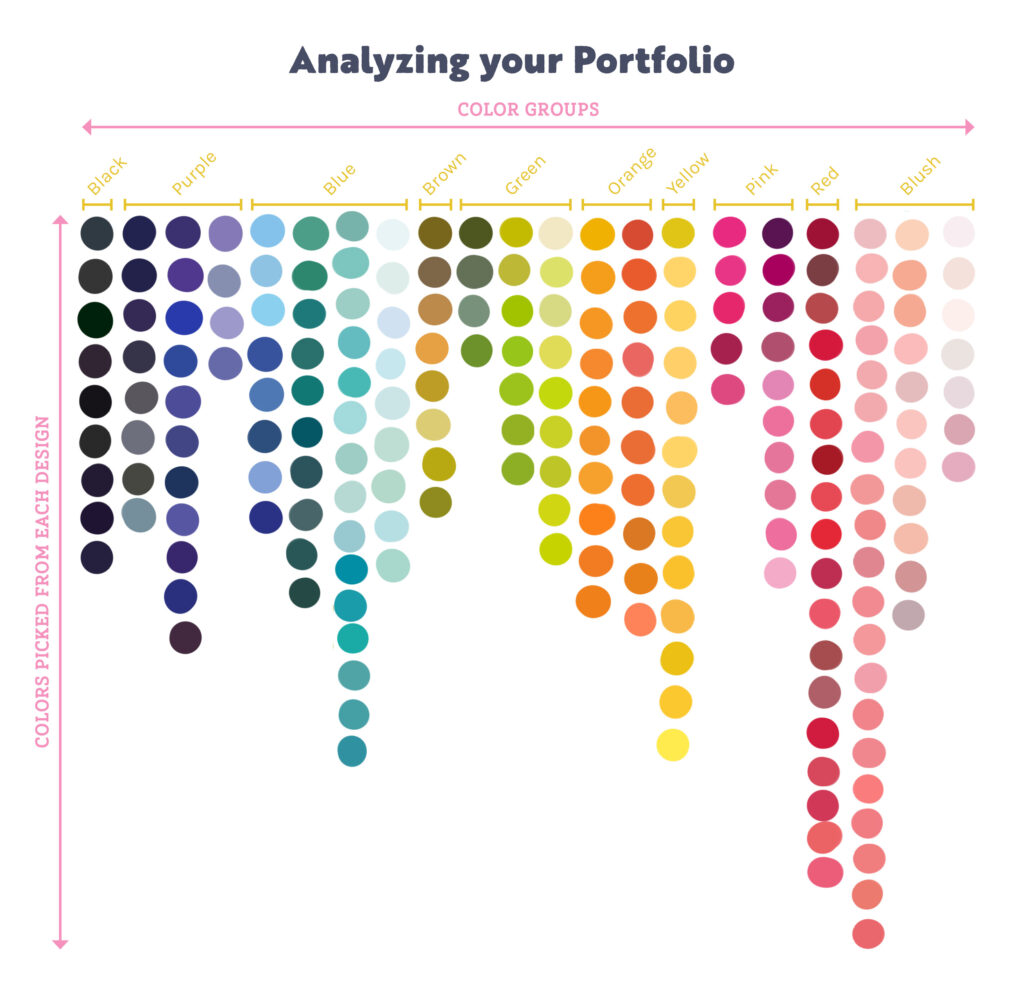
Step 1: Identify Colors
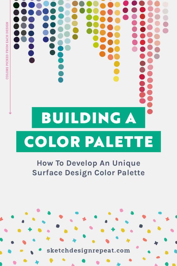
Pick out EVERY single color from EVERY design in your portfolio and put the swatch on a large digital canvas. It’s easiest if you work in a grid — place color groups horizontally and individual colors vertically. You will do this for every design that’s currently in your portfolio.
If there is an odd portfolio piece you are not 100% happy with anymore — don’t include it in your color swatches right now, as it might distract you in the next step.
Step 2: Analyze & Combine
After you’ve arranged all your colors on a single sheet — take a closer look at every color group and check which shades are fairly similar (there’ll likely be several that are).
Combine them into a single color and get rid of the extra swatches. This way you’ll already drastically reduce the amount of colors.
Step 3: Narrowing Colors Down
Next, mark any odd colors that are sticking out and check if they are working for you. Sometimes you’ll need a color for a certain design, which you wouldn’t typically choose.
In those cases, I would suggest not including it, because it was a one-time thing. If you happen to need it repeatedly in the future — add it back to your color swatches later.
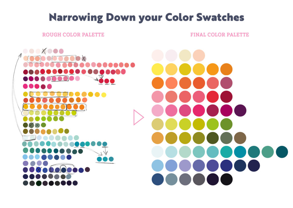
Step 4: Ensure a Good Range of Color
Make sure you include a good range of colors from very light, pastel colors to dark and saturated ones. This will give you a much better contrast and a larger range to pick from.
If in doubt, turn your canvas into greyscale and check if you have enough contrast from almost white to almost black. Of course, you can always use a lighter or darker version of the same color in your designs. Don’t let the colors restrict you — the swatches are here to help you, not restrain you.
How to use your color swatches
New Designs
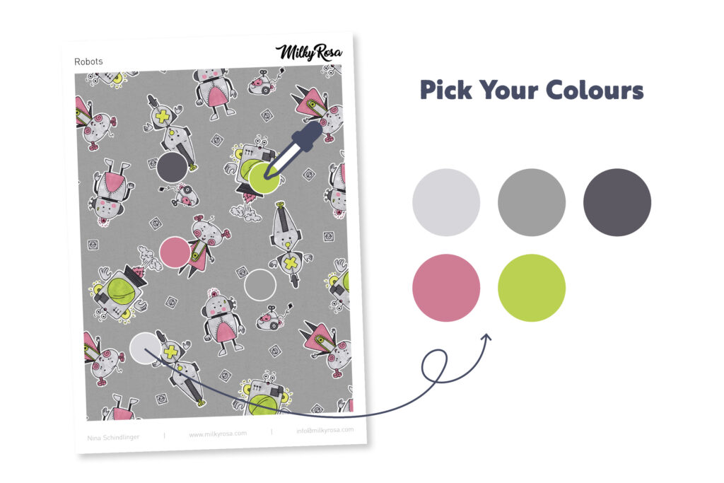
Whenever you start creating a new collection and need to pick your colors, head to your own swatch panel and pick from there and customize the colors until they work for your design.
Using this method reduces stress for me, as I don’t have to start from scratch when picking colors. Also, the amount I can pick from is now down to 66 — from previously being in the thousands! This way I also work quicker and adding another color variation is fun again, instead of being overwhelming.
Reworking Old Designs
Were there any odd designs which you didn’t include in the analysis? If so, you might want to rework these designs. It’s also a great opportunity to check if color was the only reason you felt it didn’t seem good enough for your portfolio anymore.
Whenever I did this with my designs I realized that I had a few pieces where I liked the overall idea, but I wasn’t fond of the execution anymore, because my style and color choices had changed over time. That’s when I rework the entire design or collection and end up with a design I love, which fits in with my new color scheme and leaves me with “new” artwork I can send out to potential clients.
By analyzing my designs, I make sure only my best pieces are included in my portfolio and using these steps to create my own custom color palette has helped me to strengthen it over time. I’m sure it will do the same for you.
I just want to mention again: Let the color swatches help you — not restrict you. They are a tool to make your life easier, so have fun with it!

Written by Nina Schindlinger
Website: www.milkyrosa.com
Instagram: @milkyrosadesignagency
Nina is the founder and creative director of MilkyRosa Design Agency. She specialises in branding and product design for companies that are young at heart. Her design style is bold, playful and charming, which she uses for her own line of products to make the world a fun and colourful place.


Great blog. Having returned to graphic art in 2021 after 35 years absence, trying to learn Ai. The pre program for color swatches was overwhelming. I love colors, just about all of them, and working printing industry in the 1970’s running a press and being the artist too. Our colors were limited. I like this grid idea. Halfway through PYP, I started putting my hand drawn art on a wall. Trying to grasp a style and color wheel. Snapping photos of both. I have spent my lifetime living between the pages of Vogue even when I wasn’t connected to the art world. Following color trends and styles with Pantone growing out of its limited printing colors way back when. As the base, it just cycles every 10 to 15 years. Tones and Intensity we use to call it in the printer industry. Looking at your rough draft palette, then your final one. I can see how the process will work in relationship to each seasons – Pantone colors. I’m just now returning to Ai again to the place I left off at because Life’s natural disasters took over for a while. This lesson is very timely. For I had taken my watercolors, pens, colored pencils and made color charts with the company product numbers next to them and name. I started adding it to the side of my art. Like we did in print shops off finished margin marks. This blog is a confidence picker upper. I’m now 69, still at image trace. I’m giving Ai 6 more months, if I can’t figure it out, I’m switching to PS to see if that will work for making my art work digital ready. Let’s just say. . . . Dotted half tones, a loop, a glass table, plus a big 8′ Brown camera with only 8 settings made photos and art work a whole lot easier to copy and burn a printing plate. Your visual and my visual have come together to create a pathway for actual to digital to go forward on the same paper and screen. That’s what education is, a pathway forward.
Hi Ann, thanks for leaving this lovely comment and I’m glad it helped you. I mostly work in PS myself, as it lends itself better to artwork with texture or digitising traditional pieces. I still use my colour palette as a base, even in PS. And as you mentioned, it also works great with real life swatches! I have some with my copic markers too 😁 Nina