
My Bachelor’s Degree is in design with a double emphasis in graphic design and illustration. As a result, the classes and assignments were often fluid between the two methodologies. This fluidity has been incredibly helpful throughout my creative career and especially as a surface designer.
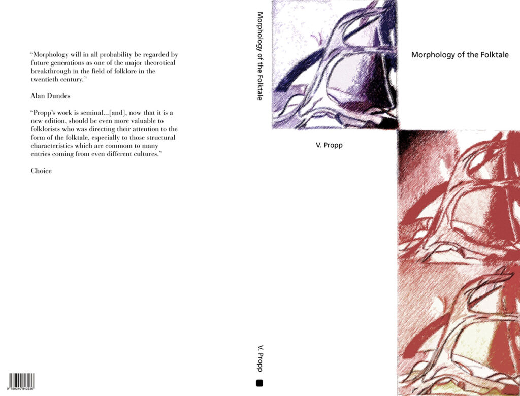
One of my favorite assignments in my design program was called Ad Hoc. For the assignment, we were given a selection of graphic design projects to complete along with a written list of prompts to help with developing it. The main objective was to use existing illustrations we had already completed, either for previous assignments or on our own time, to complete the new assignment.
The translation of ad hoc from Latin is “for this” and in English it is typically defined as “for this specific purpose.” Looking back, our assignment’s specific purpose was to look at all of our illustration work we had at our disposal and modify it (or keep it as is) to visually communicate the design projects for a book cover, magazine advertisement, and poster.
It was an incredibly freeing concept for me because it made me realize that there is not just one way to utilize an illustration, piece of art, or pattern.
Even though the particular assignment and the idea behind it was very specific, and initially felt limiting, it actually provided a new mindset in looking at all of my artwork moving forward. For example, I scanned and recolored artwork that I had created and saved from elementary school and used it in the layout for the book cover component of the assignment. And I began to look at everything I had ever created in a new light.
As surface pattern designers, it’s good practice to look at our creations before and after we complete them and imagine all the various ways that they can be used on a variety of products and in different markets. It helps by focusing on the companies we want to work with and making sure our work is in line with each company’s product aesthetic.
But I think we can stretch and expand our portfolio more by developing a mindset that we aren’t only limited by what we create today or within a certain period of predetermined time within which we’ve convinced ourselves or possibly been told that our work is still “fresh.”
Shannon’s discussed this concept on Instagram many times and even created a special hashtag, #oldbutstillawesomeart, devoted to celebrating old artwork in our portfolios. Feel free to join in after using some of my tips below to refresh some of your own art.
You may think you don’t have much work, but you would be surprised when taking a full inventory of everything you have. There have been times that I’ve thrown away drawings but I ended up using them when taking a second look as I was walking past the trash can. I’m usually my harshest critic so I make sure that part of my workflow is taking a break to see my work with fresh eyes and perspective.
There’s honestly so many things that can be done to develop our existing work to refresh and expand our portfolio. Here are my top tips:
Recolor
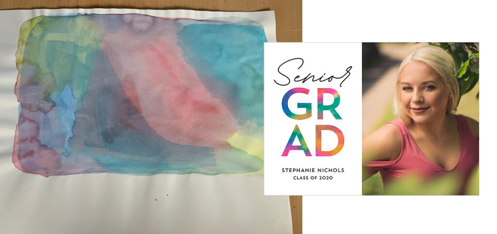
This is a simple way to update old work, especially if you would like to have your work fit into a different market. Try using colors that are trending for the season, market, or year. If you have a full color piece try it in black and white, monochrome, or vice versa. Even small color changes can make a huge difference.

BONUS TIP: The recolor tool in Adobe Illustrator is a great resource if you work in vector and there are many different approaches in Photoshop for adjusting the color for traditional media.
One of my favorite approaches to adjust the color in Photoshop is to use a hue/saturation adjustment layer. Clicking the colorize checkbox will remove the color from the image and overlay it with the hue and saturation from the sliders, which is really handy when you have a scan of a colored texture you would like to adjust to a different color.
Simplify or Add Details
Look for ways you can simplify an existing piece, such as removing texture or creating silhouettes out of the motifs. Or do the opposite such as adding texture to the background or your elements to create a more complex design. Adding or removing motifs is another way to change the overall look as well.
Related Article: How to Develop Your Surface Design Portfolio
Scale
Adjusting the size of your motifs, whether making them bigger, smaller, or a combination of both can dramatically change the appearance and style of the design.
Pattern Type and Arrangement
Additionally, the arrangement and type of repeat can be adjusted to create an entirely different look and feel. For example, you can adjust a tossed repeat into a full half-drop repeat pattern layout. You can also try rotating the motifs and changing the arrangements in relation to one another.
Not sure what a half-drop pattern is? Here’s an article that describes the most common surface pattern design terms, including half drop patterns.
Layer Motifs
Repeat and layer motifs for more complexity and dimension. One way to do this is to layer silhouetted elements behind more detailed and colored motifs.
Ever since that Ad Hoc class assignment, I’ve found myself looking at my old work to create new work throughout my creative career.
My sketchbooks are often one of the first places I will check. Of course, there are times I won’t use anything from them, but it will provide me with a jumping point for inspiration. I used to keep all my sketches stored in my office but that soon became a space problem. So my current system is to scan my artwork and keep it all digitally stored in folders by motif type on my external hard drive and cloud back-up.
Now I only have an accordion file folder of curated art and sketchbooks that I keep on one of my office shelves instead of multiple shelves and large portfolio storage folders. Having a catalog of digitized artwork is a great space and time-saver when you’re hunting for design inspiration.
Want even more tips to improve designs already in your portfolio?
Shannon has a quick 30-minute class on Skillshare, Stronger Patterns Made Easy, where she demonstrates her four favorite techniques for improving surface pattern designs.

Written by Cody Alice Moore
Website: www.codyalicemoore.com
Instagram: @codyalicemoore
Cody is an artist, illustrator, and surface pattern designer with over 15 years of experience. Cody discovered surface design while working for four years as an art buyer for a national photo lab. Since 2019, she has been creating art full-time for her budding portfolio and growing collection of licensed designs.


