
In a world of typography, the art of hand lettering makes alphabets seem a bit more personal and interesting. Hand lettering is a great way to show off your personal style and personality as an artist.
While it can be fun to pursue hand lettering as a visual language, it may get tricky to learn along the journey because of the plentiful hand lettering styles and artists to learn from. So the question of ‘how exactly to improve’ may arise, which is why I’m here to help you on your journey with six tips to improve your lettering skills.
1. Keep reference styles ready
As artists, we aren’t idea machines 24×7, especially in the learning phase. You may have a starting point or have even created your lettering, but it just might not feel like your best sketch. I understand, which is why I highly recommend having some reference images ready as inspiration.
Keep your desired hand lettering style in mind and search for artwork online that you somewhat want your piece to be inspired from. It can be a work from your favorite artist on Instagram, an art guidebook, or our trusty friend Pinterest.
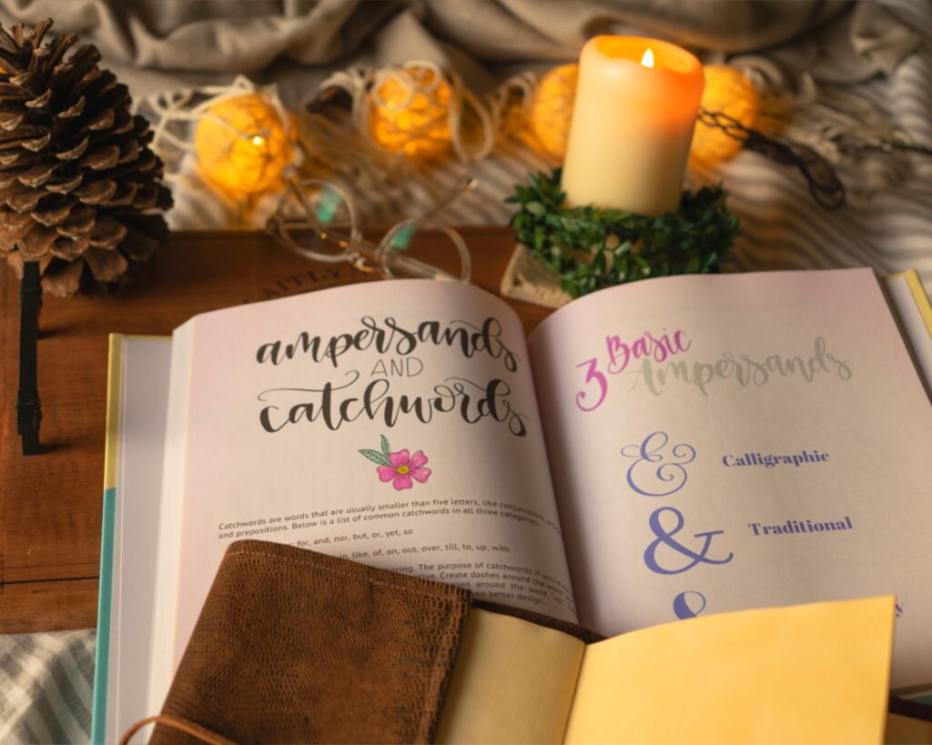
While getting lost within the ‘finding inspiration’ phase is possible, to overcome that, set yourself a timer. Manage time easily by searching for key terms like ‘vintage lettering,’ ‘modern lettering,’ or maybe ‘playful lettering,’ whichever suits your goal.
Keep in mind to use your inspiration just as a starting point to boost your creative gears. Refrain from copying and do not monetize on it!
Over time, you’ll notice that you prefer some styles over others. You may even require yourself to look out for less inspiration and more of your original ideas. You’ll come to terms with your artistic improvement as time progresses and see overall growth in the way you come up with ideas!
2. Use guides until you’re confident
To learn any skill, we start small. For example, we don’t learn to write paragraphs before we learn the alphabet. It may seem obvious, but it’s true. The same is true for hand lettering.
To create a well-thought-out and balanced piece, use guides! Guides are simple lines or grids that help us achieve straighter letters, better compositions, and an overall well-balanced hand-lettering look.
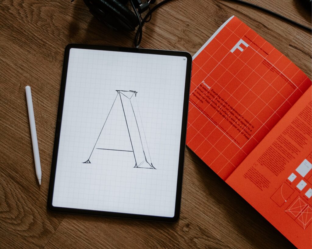
Imagine how you want your lettering piece to look. Do you want the letters to look ascending, triangle-shaped, or inside a banner? Guides can help you figure it out easily.
Artists of all skill levels can benefit from using simple guides to improve their lettering. If you’re a traditional letterer, light pencil lines with rulers can help you see the composition well before even placing your letters. If you’re a digital letterer, there are built-in guidelines in your program of choice.
Don’t shy away from using guides, whether you’re a beginner or a professional, because we all need it! It doesn’t define how good or bad you are as an artist. I remember rebelling with myself thinking that I wasn’t talented enough to draw well if I used guides, but when I saw that professional artists use them (and yield better results), I didn’t go a day without implementing them. Guides can be a tool to help you improve and to add to your already existing lettering skills. Please make them your best friend, forever!
Related Article: Hand Lettering for Beginners: Mistakes to Avoid
3. Don’t ‘write’ letters, ‘draw’ them
This piece of advice was one of those that changed the course of my lettering journey. At first, I thought that to do lettering, I may just need to write the letters as I would write on paper. But no, that isn’t the process you’d want to take.
Writing letters means simply making them in one stroke, without much thought behind the form, shape, or foundation of it. In simple words, it can also be termed as handwriting, and that’s not what hand lettering is!
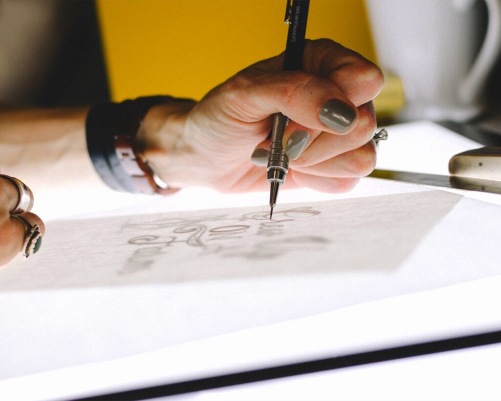
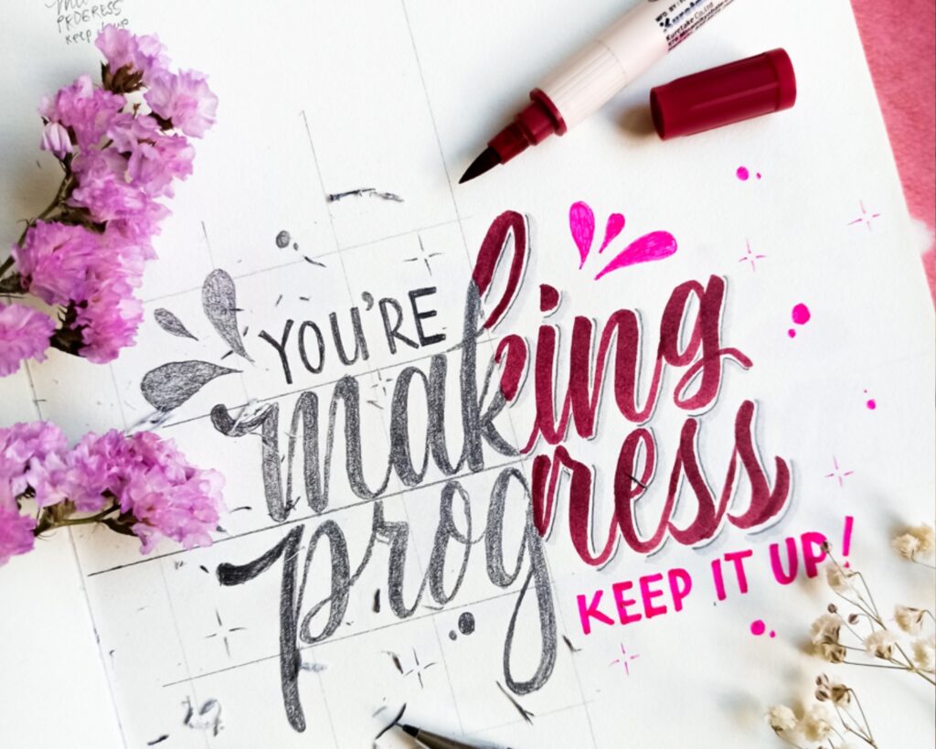
Drawing letters means building them from scratch. Imagine you wanted to draw a subject matter that you want to improve on. The sketches usually have rough and jagged lines with multiple versions, erasing, creating, repeating, right? That’s exactly what you need to do in hand lettering!
Taking the time to build your letters helps you see the relationship between each letter you draw and allows you to experiment with room for error.
It also helps you gain an eye for the entire artwork as opposed to simply writing it. Well-constructed lettering pieces tend to come from artists who took the time to draw the letters and add their flair to them.
Do you want it to look ‘spooky’ for a Halloween theme, ‘bold’ for a Valentine’s theme or ‘vintage’ for a Christmas theme; it’s all up to how you draw them! The look and feel of your lettering cannot be achieved by plainly writing it and this is why taking good time to construct the form of letters according to your message or phrase leads to greater finished pieces!
4. Zoom out, refine, repeat
You’ve prepared your ideas, guides, and references. All of these instruments will assist you in making an efficient piece of work. Building any work of art involves discipline in terms of brainstorming, putting in effort, and analyzing what you’re going to produce in the end. Keep in mind that this does not happen all at once. Getting inspired by Sketch Design Repeat, I came up with Zoom out, Refine and Repeat!
When we’re constantly working on a piece of art, our eyes may get too used to it and not be able to see different possibilities. If you find yourself stuck in a rut, zoom out!
Zoom out and make your canvas appear tiny on the screen and see what the big picture looks like. Is it balanced? Legible? Puts across the message well? Have a look! This is one of the easiest ways to cancel out unnecessary elements that might be pulling your piece down.
For traditional artists, the equivalent of zooming out is looking at the piece from a distance. What stands out? What cancels out? Is something too repetitive? Change it!
Refining means to work on the things you noticed in the earlier step. It will easily boost the way your sketch looks.
And lastly, repetition. At times, we may not notice a thing or two up until the last moment, which may require you to continue refining. So in simple terms, follow these steps until you find a sweet spot where you can say to yourself, “Alright, it’s time to finalize the sketch with better line work and later on, add colors.”
Just make sure that things are concrete before you step into adding color to your lettering. Ultimately, remind yourself not to overdo a sketch, because a sketch is a sketch, it’s not meant to be too perfect.
5. Let it be a bit imperfect
It is natural to want to make our art look good enough or to even go to the extent of trying to make it perfect. But as a human, a beginner, or a seasoned hand letterer, it’s impossible to achieve perfection. In fact, it’s best to stop yourself from doing that.
Typography has a strict and perfect look to it, but that’s not what we are striving for. As hand lettering artists, our goal is to always have that human or hand-drawn look to our letters which helps us stand out in the art community.
I was, and still sometimes now fall victim to striving for perfection. It’s normal. The key here is to acknowledge your actions and stop yourself from trying to achieve perfection, at the right time.
Let that letter look a bit wonky! It’s fine because now that you’ve acknowledged it, you can be careful next time! That’s how we all improve, don’t we?
6. Don’t fear experimenting
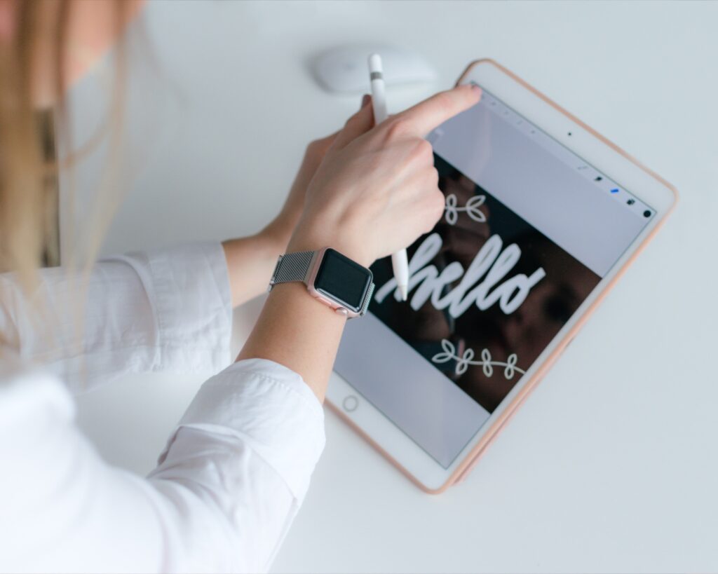
Experimentation is an act that helps us discover what we like, dislike, and what we are comfortable making a part of our artistic personality. All the above tips can be combined and applied to your art practice! Experimentation to me looks like gathering inspiration, sitting down with my iPad, loosening up and creating work that slightly challenges me but is still around my lettering comforts.
As artists, over time, we feel the need to change our way of doing art and also what we create. Like humans, art styles also evolve, and experimenting with your art can help you evolve. Over time, I’ve realized that I cannot imagine myself doing the same style again and again for years in life.
We may fear that we may be known for a particular style only in our community, but just think about this; don’t you feel a sense of ‘wow’ when you see your favorite artist try something new? It adds fun to the journey! It doesn’t mean you have to constantly evolve. Adding new nuances within our work keeps it fun and fresh for ourselves and also the viewers of our art.
Also, you don’t always need to try new lettering styles but instead, just sketch away at little doodles and illustrations or study any art in general. Allow inspiration in experimentation to strike anytime!
Be a work in progress and make consistent efforts to refine your lettering.
It is important to challenge your skills and try new things in your growth phase because it directly impacts your skill levels. Depending on your needs and path, you can use all six of the above tips at once or one at a time. Lastly, to prevent burnout, always remember to take breaks in between your lettering sessions. Happy hand lettering!

Written by Daksha Giri
Website: www.dakshagiri.com
Instagram: @dakshagiri
Daksha Giri is an illustrator and lettering artist based in India who creates beautiful and unique artwork that is both visually appealing and emotionally resonant. Her work is seen in greeting cards, packaging, giftware & home décor.


What is the name of the book shown under #1 for references?
Hello Tena! The book is by Amanda Kammarada, and is called: Hand Lettering Guide: Step by Step Hand Lettering for Beginners Workbook & Hand Lettering Practice Book for Relaxation