
The start of my own journey to practice hand lettering began a little over a decade ago. I was always fascinated by fonts as a graphic designer and in 2010 I decided to try my hand at creating lettering layouts from scratch.
It took years of practice to get to where I am today – a confident licensing artist who now specializes in BOTH patterns and lettering.
I made a lot of mistakes in those early years, many of which immediately made my efforts look amateurish. But as a licensing artist, that’s the last thing I wanted! Especially as I delved deeper into surface design and realized how useful well-crafted hand lettering designs would be in my portfolio.
Because hand lettering isn’t required in our industry, but it can help set you apart from other designers. So if you’re new to it and want to develop your own lettering layouts, today I’m sharing the four most common mistakes I see in beginners so you can avoid them (unlike I did). In no particular order…
1. Incorrect Thickness
One mistake I see often (and not just from those new to hand lettering) is thickness being added to the wrong part of a thick and thin letter.
It’s most common with letters that have more than just a single vertical stroke like the letters A, M, N, and W.
Usually, the incorrect thickness will be added to either the first vertical stroke as is the case with the letter A, or on the outside strokes for M, N, and W. It’s a mistake I often made myself in my early lettering years and to this day, I will occasionally catch myself sketching it incorrectly.
But adding thickness this way ends up with awkward feeling letters and that’s because the thickness should instead ALWAYS be placed on the downward strokes of any letter.
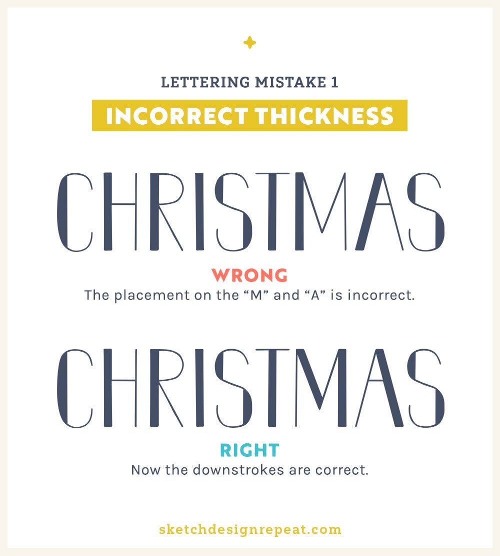
Think about how you write the letter “A” for example. You draw it from the baseline up and then back down to the baseline. The first stroke is upward and the second stroke is downward, so that’s where the thickness needs to be.
So when you’re creating thick and thin letters, double-check every time that the thickest part of each letter is on the downstroke.
2. Obsession with Swirls
When first learning how to create script or brush lettering, it can be really easy to get carried away and add in too many swirls and loops to words. Unfortunately, that often means awkward connections between words or the lettering being overwhelmed, or even worse, hard to read.
Obviously, you don’t want to sacrifice on style (as that’s often the most fun part of hand lettering for beginners), but you also don’t want the lettering to be overshadowed by too many loops or make the reader see a different word than what you intended.
So if you’d like to try adding loops or swirls when you practice hand lettering, start by including only one or two into a piece.
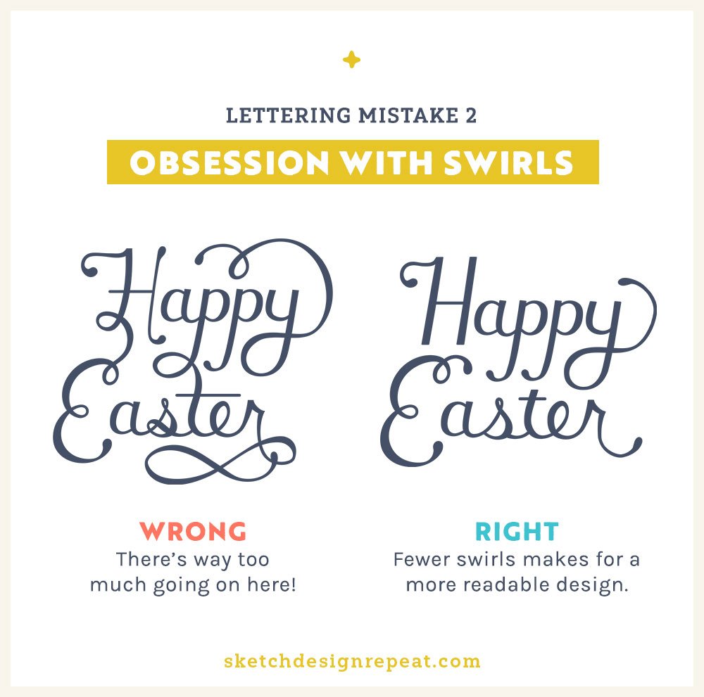
Then as your lettering improves, you can experiment by adding in an extra flourish here and there. And if you’re unsure where to start, the two easiest places to add loops or swirls to letters are:
-
Any lowercase letter with a downstroke like G, J, P, Q, and Y.
-
The first uppercase letter of a word, especially with the script lettering style.
3. Too Many Styles
Each lettering piece should have its own personality, but beginners sometimes try to cram as many styles into one piece as possible – the result can end up looking confusing. The biggest issue is when using clashing lettering styles because it can make your design look awkward.
Here is “less is more,” especially for beginners. Start by including only 2-3 styles that have a lot of contrast.
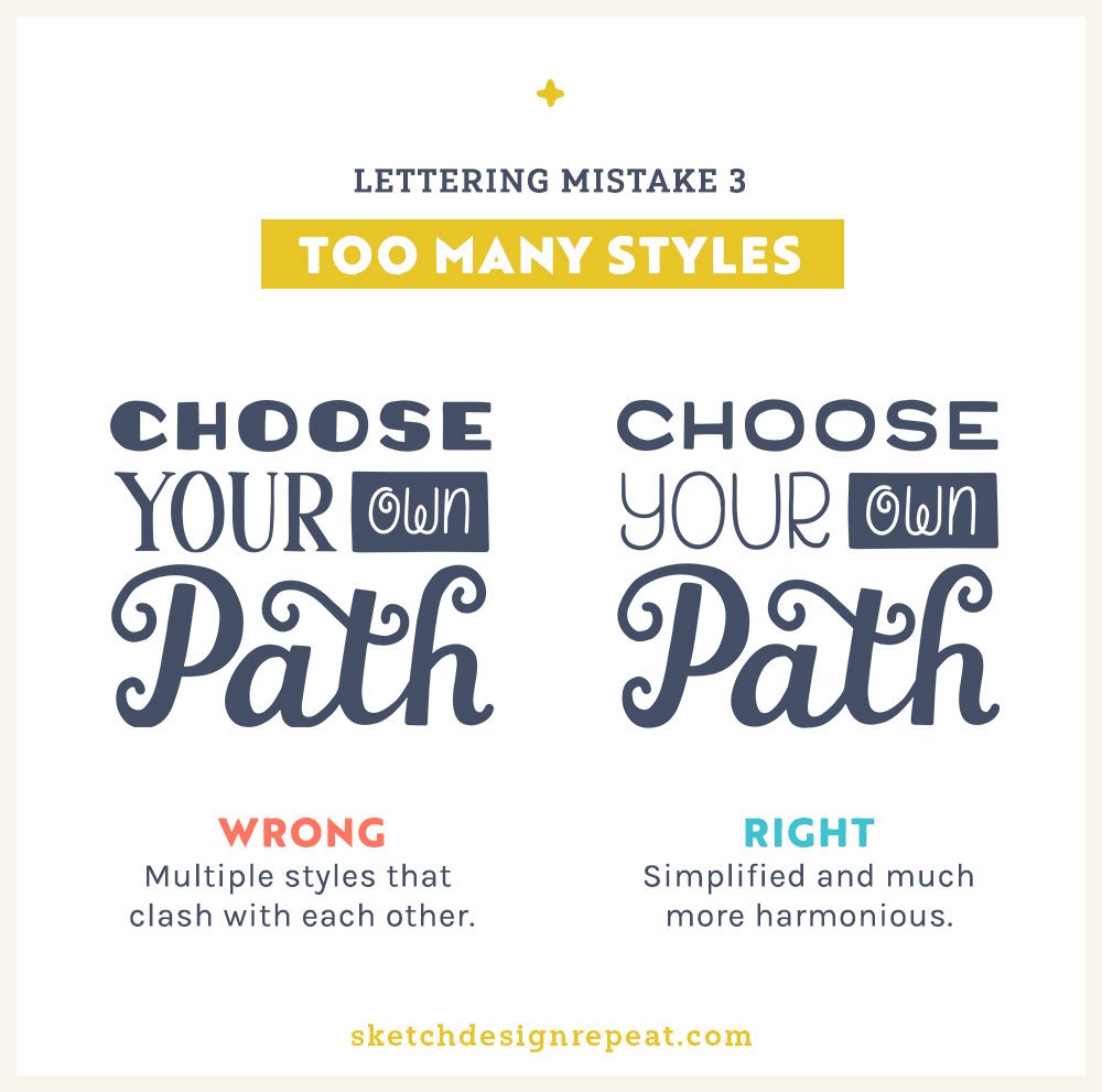
If you’re not sure what styles pair well together, FontJoy is a great little website that’ll suggest font pairs – just keep refreshing the page or play with the contrast slider at the top of the page for new ideas.
Now can you use more than 3 lettering styles in a single design?
Absolutely! It’s totally possible to do well-designed lettering layouts with 4+ styles and it’s something you can experiment with over time or in your personal work, but you’re more likely to have sellable portfolio pieces if you master the art of pairing 2-3 styles together first.
4. Stretched or Distorted
It’s something I see most often in designers who create artwork in Illustrator – they’ll just exaggerate a design by stretching it.
But the point of lettering is to be read, so if you stretch or distort letters too much, you can make an entire piece unreadable.
Now I do want to say here that there’s nothing inherently wrong with using super skinny or slightly odd-shaped letters. In fact, unusual details can add a lot of character.
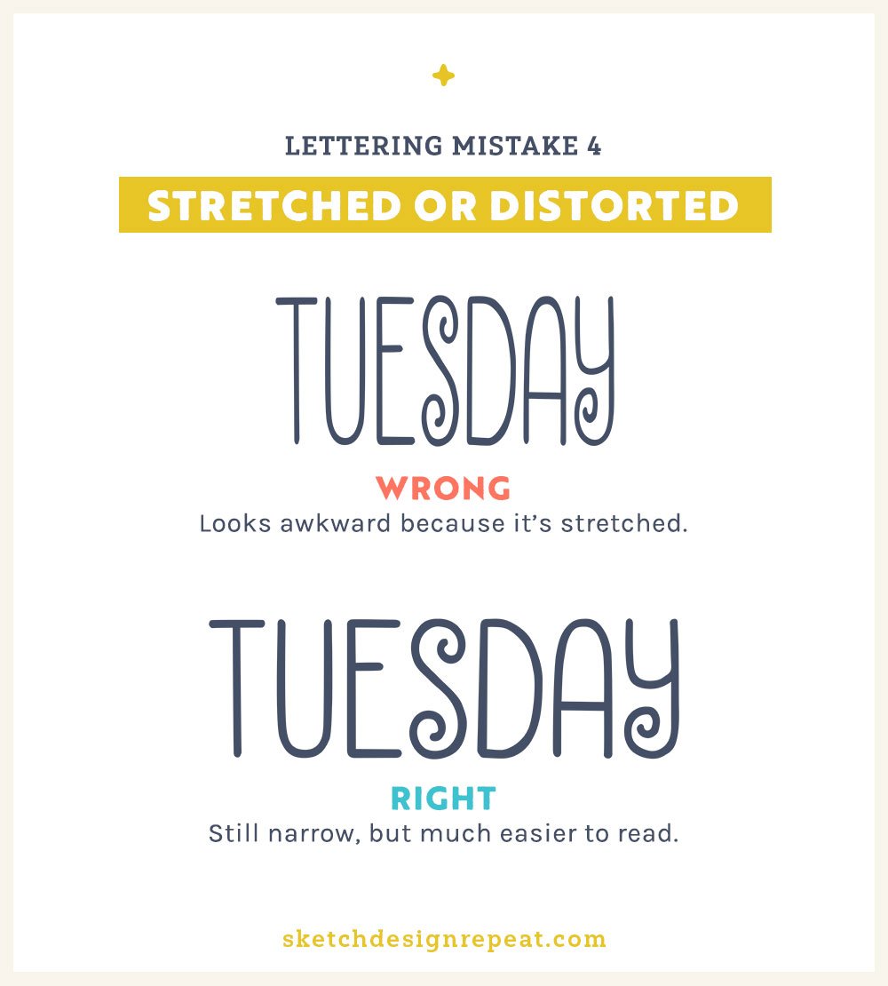
But once you’ve sketched them out, it’s a good idea to take a few steps back and see if you have any trouble reading it. Or better yet, send your in-progress sketch to a friend and ask them if they can.
If you or your friend have any trouble with it, you can go back and make changes, which is much easier to do at the initial sketching phase rather than once the piece is nearly finished.
And there you have it: The four worst lettering mistakes you can make, but now you know how to avoid them!
And if you’d like to learn more, check out our class, Hand Lettering for Surface Designers, that’s geared towards beginners looking to use hand lettering for their art licensing portfolios. You’ll learn the all the basics (like the mistakes shared in this post), plus how to build your own hand-lettered layouts from scratch.
There’s even a few hand lettering practice sheets inside the class workbook to help you get started!
Want to save this post to find it later? PIN IT!


Very interesting Shannon, as this is an area new to me and one I have been considering playing with.
The timing is perfect – Thank you!
Thanks Shannon! Have a great time in Dublin!