If you’ve asked, “Do I need a website for my surface pattern design business?” or “When do I need a website for my surface pattern design business?”
The answer is “yes” and “now.” So let’s talk about websites…
It’s easy to start looking at successful surface pattern designers’ websites and get overwhelmed. Heck, it’s easy to just google “website platforms” and throw your hands in the air, close your laptop, and run into a forest away from anything with a power outlet.
Hopefully, the few don’ts and do’s I’ll share here will help you overcome that overwhelm and get you on the way to creating one website for your business, no matter how many streams of income you have or are working toward (we’ll get to it).

Note: I’m usually a positive-first person (and the phrase is technically “Do’s and Don’ts”). We’re starting with don’ts because what you don’t need will make you feel more confident in tackling the things you do need to consider to get started.
What You DON’T Need (to get started)
A Website Developer
You can do it yourself — I believe in you! Additionally, sites like Squarespace [AFFILIATE link] make it extremely easy to get started. I personally love Squarespace because of the drag and drop functionality, as well as the ability to scale plans and manage domains from a single platform.
You can start from a template or build each page from scratch making it even easier to “plug and play” if you want with your art!
A Logo
Hot Take: One of the hurdles artists have in getting started promoting themselves is often having their visual brand look *juuustttt right* (and really, will it ever be?!). Don’t let that stop you from establishing your home on the internet.
You can start with a simple text-based header, using your name or business name. Branding is extremely important, but starting simple is absolutely okay.
Side note about URLs — I started my surface pattern design journey using my name as my URL (I already had the domain because I wanted to hold it for a career portfolio site) and didn’t officially split my business to a separate site until 2023 (my art is on CoastLStudio.com and LeahKeggi.com is where I collect marketing resources).
If you’re thinking about using a studio or business name but want a domain that you can hold on to, start with your name if it’s available.

A Weekly Blog
There’s a caveat to this one. You need a place where you can share updates, collaborations, and content — but it doesn’t have to be called a “blog” and it doesn’t have to be weekly.
For my site, I use “Studio Notes” but you can call it something cute like “Field Notes” (perfect if your art is very nature-forward) or “Artist Musings.” Avoid anything with “updates” or “news” so that it doesn’t give the expectation of being updated super regularly (and removes the pressure from you).
A Complete Portfolio
To get started with a portfolio site, you just need a good representation of the work you have — it does not have to be complete. You’ll definitely want something to share with companies when they find you via your website, but it’s not a requirement to build your home on the internet.
You also don’t have to make your complete portfolio available on your website if you don’t want to. Many artists only share a highlight reel, or password-protect their larger body of work!
Related Article: How to Protect Your Art on Instagram & Online
What You DO Need
A Core Color Palette
You may not need a logo to start, but I recommend a core color palette for your website. Beyond customizing background block colors and links, focusing on a core palette will help your site feel more cohesive!
I use about five colors on my site in backgrounds, anywhere I share flat patterns, or on sales pages. I try to stick as close to those colors with mock-ups and lifestyle photos as well. Tip: as long as the main color in the photo fits with your color palette, it generally will fit in.
The place that you can loosen up on this rule is in your not-weekly-blog section when you’re sharing work or inspiration that may be outside of a limited palette.
Examples of Past Projects (Real or Mock Ups)
As I mentioned, you don’t need your whole portfolio on your site, but you do need to show off your work! Mockups are a great way to do this as you build your experience. You should only show off what you’ve made in a way that people know how they can work with you.
These will be even more important on specific pages (we’ll get to it), but should be spread throughout your site so people know what you do however they land on your page.
Sales Page (by Revenue Stream)
If you saw the word “sales” and felt icky… allow me to pull out my soap box for a second. I recently heard something that really resonated with me and the gist was this: If you don’t have a traditional agent out getting you business, your website is there to do the job (shout out to Kate from Folk Founded for sharing this concept on a webinar with Goodtype).
Shannon also discusses how to shift your perspective about marketing your art here at SDR – it’s definitely worth a read if you struggle to feel good about marketing.
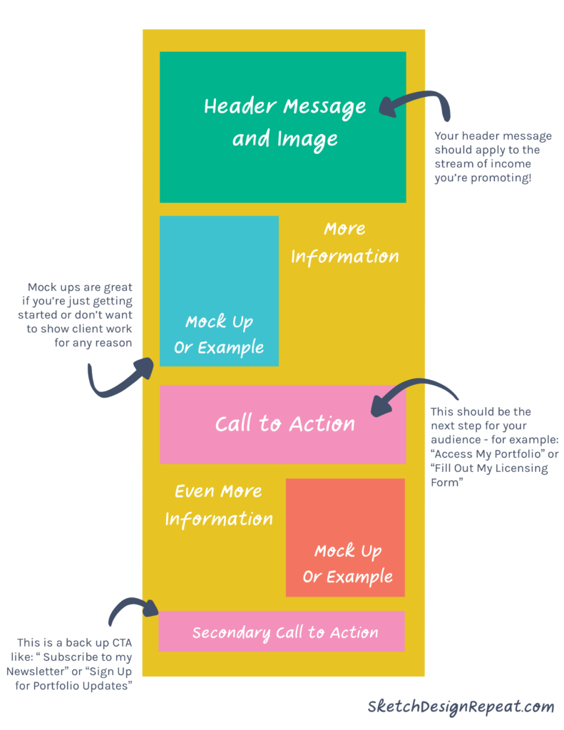
So let’s talk about sales pages that don’t sound like you’re in a used car commercial. There are three key elements: First, it starts with simple, attention-grabbing messaging that states how you can address your target audience’s problem. Next, it provides additional detail, then ends with a call to action.
- Often called “above the fold” this message should be visible without scrolling on the page, and should tell your target audience why they should keep reading. For example, my licensing page for CoastL Studio starts off with “Add a little vacation to your products with coastal inspired patterns and prints.” This addresses my consumer target audience’s desire to surround themselves with coastal décor, and addresses art directors and businesses looking to license that style of art! (For more info about identifying your target audience, check out my post!)
- Once you’ve hooked your reader, providing additional detail will help you seal the deal (and confirm that you’re the right fit). This can be a few paragraphs broken up by examples of your work appropriate to the revenue stream.
- Always, always, ALWAYS end with a call to action! This tells someone what to do next to book your services, buy your product, or initiate a project and is incredibly important to actually converting your audience. One study of email marketing found that emails with a single call-to-action can increase clicks by over 371%.

A note on revenue streams: A separate page for each revenue stream will help you streamline (sorry, I had to) your messaging on a sales page — making it easier to communicate clearly.
Rather than pitching licensing and freelance work in the same breath, separate pages can help you clearly define your offer, process, and pricing, and when someone asks for additional information on a specific revenue stream, you can direct them more clearly. Note: You can always have a combined “work with me” page on your site for easy navigation to each offer.
An “About You” Page
People generally buy from people, and creating a connection by having an “about you” page so that people can read a bit about who you are as a person and your experience as an artist is a great way to do that. While it may not be the most visited page on your site, it is important because it serves to establish credibility and legitimacy.
Tip: Make a note on your calendar to update your about page annually.
To make updating easier, reference specific dates or years in your bio — for example, use phrases like “since 2021…” rather than “for 3 years….” Oh, and don’t forget to end it with a call to action, like a link over to…
A Contact Page
A general contact page in the main menu of your website is a good idea for a few reasons, but chiefly if someone has seen your work elsewhere and wants to reach out they can skip a few steps and connect with you via a form.
It also subtly shows you’re “open for business” by giving people an easy way to start a conversation! A contact page doesn’t have to be fancy either; a simple “Let’s chat about X,Y,Z!” with a form that goes to your email will suffice.
This is also a great place to share your social media handles (below the contact form) so that people can find other ways to connect as well.
The beauty and benefit of a website is that you’re not chiseling information into stone — it’s easy to change and update as your art and business evolves.
Start small and simple to claim your home on the internet, and when you start to feel the urge to slam that laptop closed and run into the woods, remember that everyone starts from zero, and baby steps are progress!

Written by Leah Keggi
Website: www.LeahKeggi.com
Instagram: @coastlstudio
Class: Surface Design Marketing: Creating Content to Grow Your Business
Leah Keggi is a Marketing Pro and Pattern Designer looking to bring a little vacation into every day with coastal inspired design! Her work has been featured on Today.com and on products at Target.com. When she’s not designing (or working in Marketing) you can find her reading, enjoying her husband’s cooking, or walking her pup!
Great advice! Thank you so much for these top tips as I begin designing my illustration and surface pattern website Leah! 🙌🏼👏🏻🙏🏻
Thanks a lot for the helpful tips and insights!
When I first set up my website, I struggled a lot and changed things again and again. From reading your article I got a few new ideas on how to improve – an update would be a good thing!