One of the most difficult aspects of being a surface pattern designer, especially starting out, is pitching your work. It’s a very vulnerable thing to share your work and it takes a lot of courage. It’s easy to worry whether people will like your designs or wonder whether they’re good enough.
Going down this path can be demoralizing and paralyzing. One of the things that helps me conquer this fear is to remove the emotion from the process by looking at my work more analytically.
This article shares some of the hints and tips that I use to look at my work critically and analyze it before sending it out. I find these techniques help me to feel more comfortable and confident when sending my designs out for review.
What does marketing have to do with evaluating my art?
I worked in brand marketing for the first 20 years of my career. When I started my surface design business, I realized I used many of the same strategies from my marketing days when evaluating my work. I find these processes to be a helpful framework for evaluating design work, because what is pitching, if not marketing your designs?
The other benefit of this method is that the work you put into analyzing your designs will give you a head start with other marketing channels like a website or social media posts.
Some of this process may not seem related to evaluating your work but stay with me. Steps like identifying your target audience, researching product categories, and conducting a design analysis will allow you to evaluate your work much more objectively and help to build confidence.
Positioning
There are so many categories for surface design — everything from wallpaper to gift wrap to kid’s clothes. Identifying where your work fits (or how it is positioned in the market) is the first step in evaluating your work.
When you created your designs, you probably had some ideas about where they would be used and who would buy them. Think of a few categories or products where you can picture your designs and jot them down. If you need help, there are a lot of classes and resources (including some great content from Sketch Design Repeat) with these types of category lists.
Your Ideal Customer
Once you have a few products or categories in mind, think about who would purchase these products and what sort of things they are interested in.
Imagine an actual person who would be shopping for a product with your design. What are they interested in? How old are they? What do they do for a living? Do they have kids? Where do they live? Where do they shop? The more specific you can picture this person, the better. Put yourself in the mind of this person as you begin the research phase.
Research
Every time you look at an Instagram post, a Pinterest pin, walk in a store, or flip through a magazine, you are doing research. The trick is to start tracking and analyzing what you’re seeing.
Pinterest is one of my favorite places to begin collecting my research. My target category is wallpaper and I have multiple Pinterest boards of different types of wallpapers in different categories. A few times a year, I take a closer look at the designs I like and try to identify what I like about them. Think back to your ideal customer and start looking at the designs from the point of view of this person.
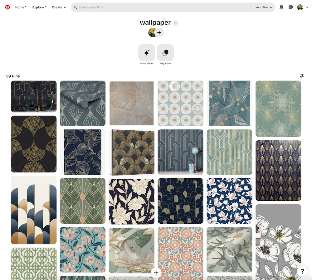
I look at things like motifs, colors, mediums, style, scale, and placement. I also look to see if there are new designs that appeal to me and what sort of elements seem to be trending. Trend reports, magazines, and websites are good resources as well.
Once you have a good idea of your target category, your ideal customer, and a group of designs that you find appealing, you can look at your own work more critically to see how it compares.
Related Article: Building a Surface Design Collection
From Start to Finish
Analysis
Comparing and contrasting your designs to others in the category will help you look at your own work more objectively and critically. You can start to identify where your designs are similar, where they are different, what you like about your designs, and where you may want to make revisions to better fit a category.
You may have heard the quote, “comparison is the thief of joy.” There is a risk when comparing your work to others that you will worry yours doesn’t measure up or you may feel overwhelmed at how much competition there is in the market.
This is all normal, but there are a few tricks to keep the comparison from stealing your joy:
- Remember that you are evaluating your work for pitching, not whether you’re a “good artist.”
- Use objective comparisons, not subjective ones. For example, “both have red apples.”
- Avoid subjective terms like “better” or “worse.”
If you do find areas to improve your designs, use a growth mindset and know that if you work on your skills, you can improve your designs. Practice makes progress!
All patterns have some characteristics in common. I’ve listed some below that are helpful when evaluating your work. There are no right or wrong choices with these elements, but going through the list will give you a good sense of how your patterns compare to others in your chosen category. This list also helps keep the comparison objective rather than subjective.
- Themes
What is the subject matter of the pattern? - Motifs
What motifs are you using? What is popular in the category? - Style
Is there a particular style that you’re drawn to, or that is popular in this category? - Medium
Is the design hand drawn, painted, collaged? - Color palette
Is your color palette complex or simple? Is it muted, bright, monotone? - Scale
How big are your motifs? Is this appropriate for the category? - Complexity
Are your designs complex, with lots of layers and textures, or more simple? - Balance
Is the composition balanced? Do the elements — color, motifs, style — work together harmoniously? - Number of designs per collection
Does this category require larger pattern collections, like with fabric, or is a smaller number of patterns sufficient, like with stationery?
Helpful hint: Create a matrix with each of these categories along the top row and thumbnails of your patterns and those you are comparing in the category in a column along the side. Jot down a few notes about the characteristics you observe for each pattern.
Filling out a matrix like this will give you a very good picture of how your work compares with other work in a given category. You will see where your work stands out, or where it may need changes.
Once you have taken an objective look at your work and other patterns in the category, write out a few sentences about how your work is similar or different. How will these similarities or differences help you break into the category? How will they help you stand out? Are there other patterns in the category that inspire you to try something new? Do you need to make changes to your work, or add elements in order to fit with this category?
And finally, if there are areas where you want to improve your designs or feel your work isn’t ready to pitch, that doesn’t mean it’s not good, or that you shouldn’t start pitching some of it.
Take a step back and look at where your work fits within your chosen category. You may decide not to pitch everything, or you may decide to make some revisions or add elements before you feel confident pitching in this category. That’s OK. Your work will be stronger by taking an objective critical look.
Test With Mock-Ups
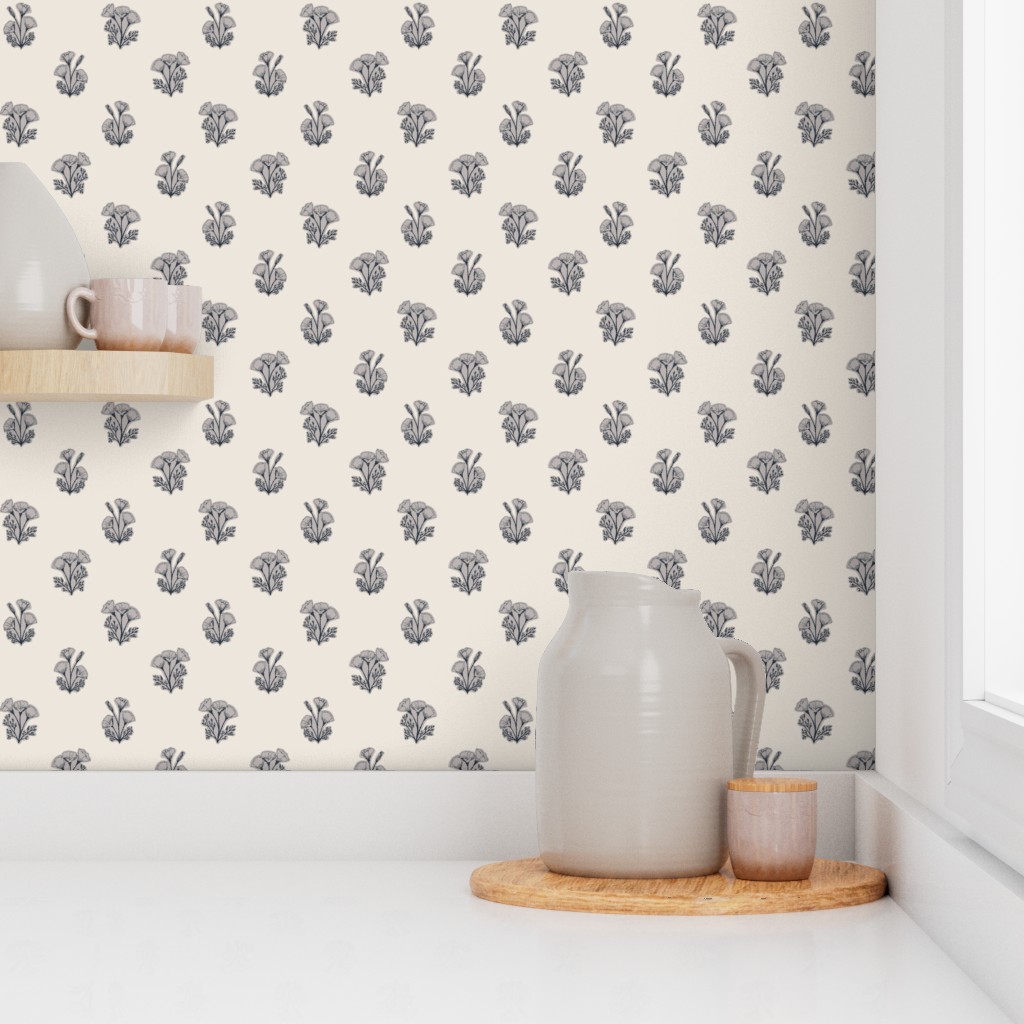
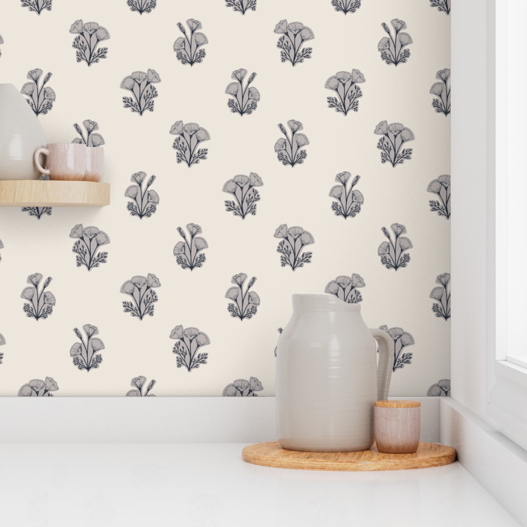
Mock-ups can be a useful tool to test how patterns will look on real-world products. I find them especially helpful in evaluating scale and color in a design. They also make nice content for social media.
There are many free resources for mock-up templates. Spoonflower automatically adds designs to fabric, home décor, and wallpaper and they have a scaling tool so you can see what patterns will look like at different scales.
If you want to download your own mock-up templates, check out online classes that include mock-ups, or sign up for a newsletter that includes mock-ups as an incentive. Creative Market is a great source for low-cost mock-ups and they often offer free mock-ups in their newsletter.
Make It a Mini
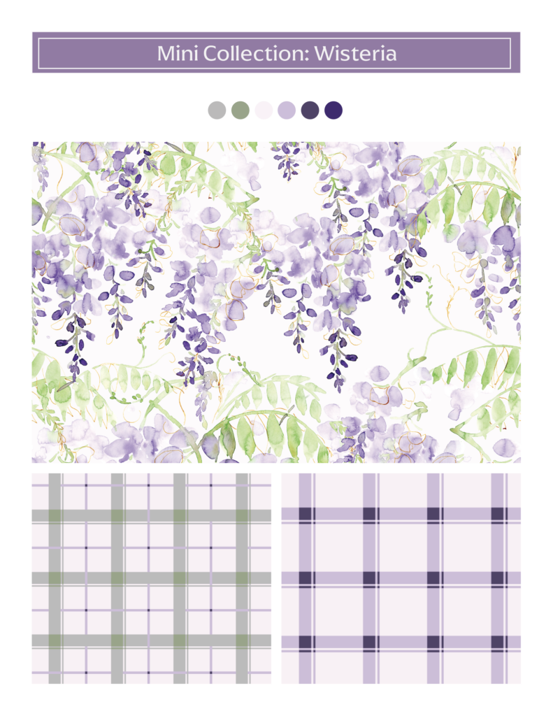
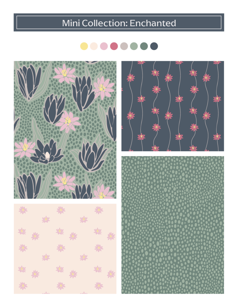
If you’ve evaluated all of your work and have 2 to 3 designs that you think are strong and ready to pitch, adding a few coordinating patterns can turn a strong design into a strong mini collection. Consider some of the classic pattern styles below to add simple coordinates or blender patterns. Add two or three color palettes to create even more variety and options.
- Stripes, dots, and plaids
- Geometrics
- Trailing patterns
- Text elements
Here are a couple of examples of single patterns that I expanded into mini collections with a few simple coordinating patterns:
Related Article: Designing Stronger Surface Pattern
Design Collections
Creative Community
Being part of a supportive creative community is also an invaluable tool in evaluating your work. There are so many opportunities to participate in creative communities. Groups on social networks, online classes, and creative memberships all have great communities. Finding a trusted group of like-minded creatives has added so much value to my practice and provided invaluable advice.
If you do get constructive criticism, keep an open mind. I shared one of my first collections with an online community for feedback. I had worked so hard and felt that the work was strong. Most of the feedback was extremely positive and encouraging, but some people pointed out that many of the designs were repetitive, and there wasn’t enough variety in the collection.
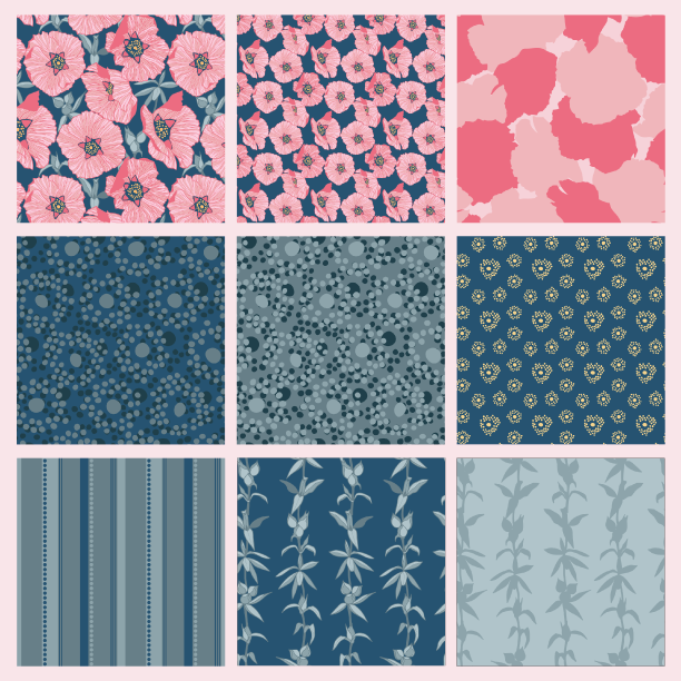
My initial response was to get defensive. (“You don’t know how long I’ve worked on this!”) But taking a breath and keeping an open mind allowed me to realize the feedback was accurate.
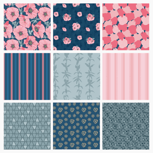
I went back to the collection and pushed myself to find more creative ways to use my motifs and to add more variety to the collection. Below is the updated collection incorporating the feedback. Many of the designs are the same, but I added a few new ones using similar motifs, but adding more texture and complexity.
Just Do It!
You’ve done the work, researched your categories, analyzed your designs, and made additions and revisions. Now take a deep breath and send it into the world. Don’t worry if you only have a few designs. One or two strong designs, a few coordinating patterns, and some color options are plenty to start pitching.
As a next step, I highly recommend Shannon’s Pitch Your Portfolio class. Her process will help you to get your designs in order, start researching potential companies, and get your work in front of art directors.
Final Thoughts
I hope this framework has given you the strategies and tools to evaluate your own work, identify your strengths, and have the confidence to start pitching. In the spirit of constructive criticism, I’d love to hear how this process works for you! Good luck pitching!

Written by Kelly Miller
Website: www.wildazuredesign.com
Instagram: @wildazure
Kelly Miller is an illustrator, pattern designer and the artist behind Wild Azure Design. Her designs are inspired by the outdoors, travel and a love of adventure. The Wild Azure style is modern, yet playful, incorporating loose expressive watercolor, with hand drawn details.
I really enjoyed reading this article, Kelly. Lots of great tips!