If you find creating collections to be intimidating or overwhelming, try starting with an illustration. This simple idea has changed the way I build collections.
When I first discovered surface pattern design, I was full of ideas and so excited to start producing work. I couldn’t wait to finish my first collection inspired by the beach. I even had a lofty sounding name, “Where the Land Meets the Sea.” On our family vacation, I diligently worked, taking inspiration photos and sketching all sorts of plants and birds. I spent weeks creating all of my patterns. When I was finally done, I stepped back to look at my collection…and it was all over the place.
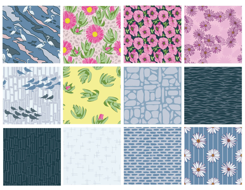
While I thought there were some good individual patterns, the collection was disjointed. There were too many colors, and they didn’t all work together. I had a bunch of hero patterns, but no connection between them. The collection included coordinates, but they didn’t work as a group. So, while my first collection checked all of the boxes, it didn’t work in real life.
I tried again, focusing on one strong motif and creating a couple of variations on the same motif. The results were… mediocre. The patterns themselves were OK, but they were too similar and there weren’t enough of them.
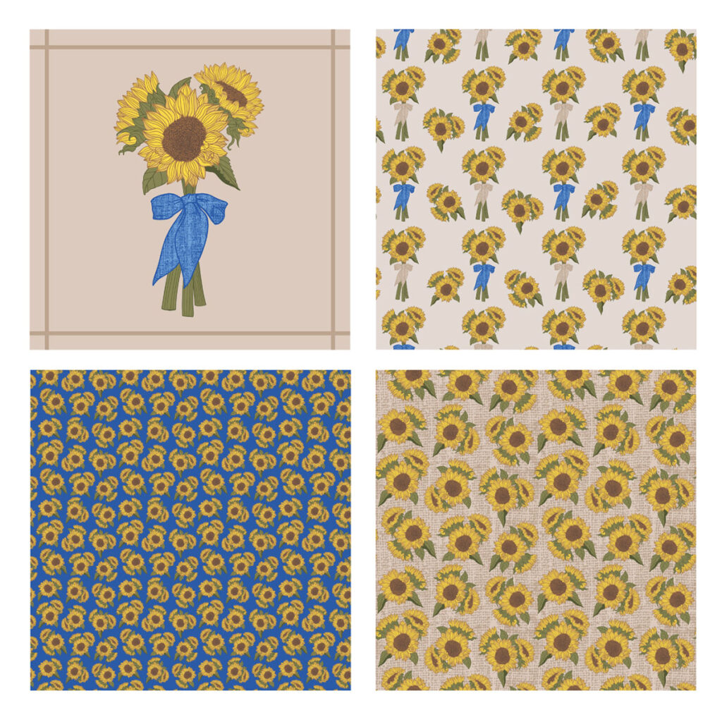
I started studying other people’s collections and was drawn to those that included illustrations. I had even tried an illustration in my sunflower collection above, but I thought of the illustration as a supporting piece to the patterns. Then I thought — what if the illustration is the starting point? And a light switched on. While this may not be the most amazing insight, it completely changed the way I thought about collections.
The “illustration first” technique works for me for many reasons. An illustration is more focused than an entire collection — it’s easy to see how different motifs and colors work together thematically and visually, but it also sets parameters to keep things cohesive.
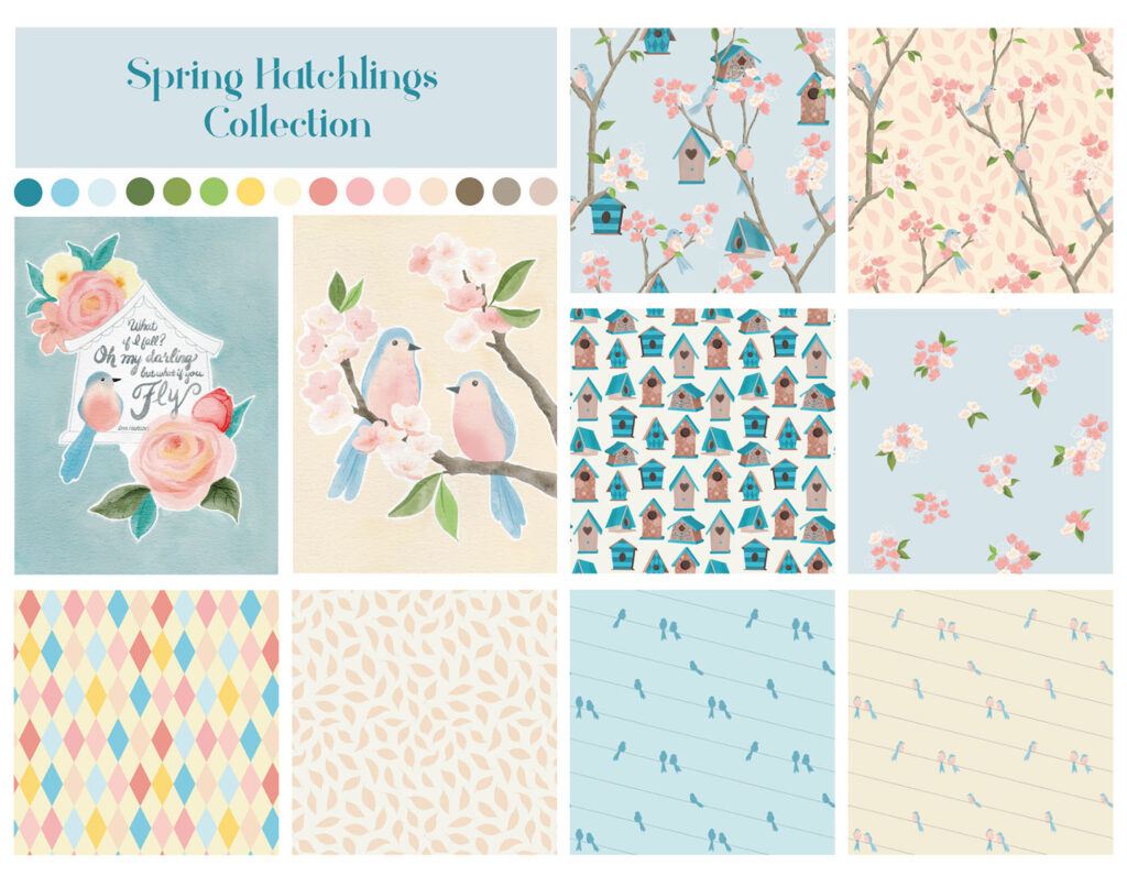
Here’s my latest collection. All of the designs work together, but it still has more variety than my initial attempts. And it came together much easier by starting with a single illustration. I’ve outlined my process for this collection below if you want to try this technique yourself.
My Process
Inspiration
I always start with inspiration, and nature is a huge inspiration for my work. I love going for walks and hikes around my neighborhood and taking a lot of quick snapshots of things that inspire me. On a recent walk, I noticed a little tree with a bunch of birdhouses hanging like ornaments on the branches. I thought the little tree was so charming and I decided to draw up a few sketches of it. I couldn’t stop thinking about this little tree and realized it had the potential to make a great collection.
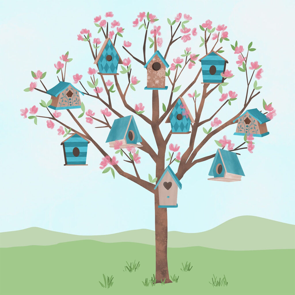
I’ve found that some illustrations translate into collections better than others. Here are a few tips I follow for creating illustrations with strong collection potential.
- Create something you’re excited about. Ideas come easier and work is more enjoyable when I’m inspired by something. That doesn’t mean I don’t want my work to sell, or that I’m not thinking of how it would look on products — I’ve just learned that my work is better if I don’t try to create someone else’s idea of what’s interesting.
- Use at least 3–4 motifs in your illustration and include variation in these motifs. This seems to be the sweet spot to provide enough variety without getting overwhelmed and disjointed. For example, my illustration had 3 main motifs — birds, birdhouses, and blossoming branches.
- Include an element in your illustration that has a pattern on it. In my collection, some of the birdhouses had patterns. These integrated patterns can become coordinates that give an additional layer of depth and interest to your collection. Other examples could include a still life with a pattern on a vase, or a kitchen scene with a pattern on a tablecloth.
Brainstorming
Using thumbnail sketches to brainstorm pattern ideas is a great way to make sure there’s enough inspiration for a collection. If you can easily fill a page or two with different ideas, you’re on the right track. Here’s a page out of my sketchbook showing my initial ideas for patterns and a few stand-alone illustrations.
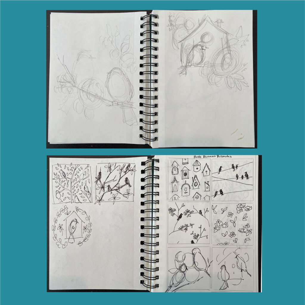
Experimentation
I like to experiment with different styles before I commit to producing all of the motifs. Illustrations are a great way to focus this experimentation to see what works and what style to use. For this collection, I played around with one of the illustration thumbnails before finalizing a direction for the style I wanted to use. I used collage, watercolor, gouache, brush pens, and a dip pen before coming up with a direction I liked.
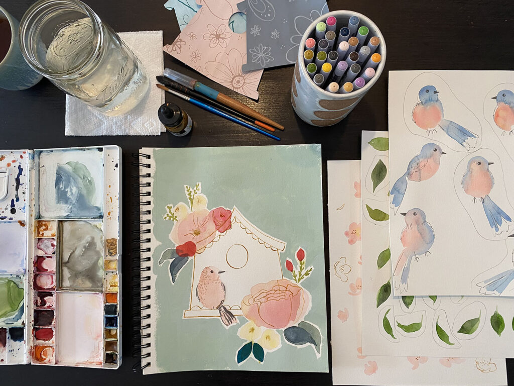
Production
Once I had a vision for my style, pattern compositions, and motifs, I went to work creating patterns. I made 1–2 patterns a day for about a week. During this part of the process, I usually come up with a few more ideas and just keep creating until I have a variety of patterns including a few hero patterns, blenders, and coordinating patterns.
Related Article: Designing Stronger Surface Pattern Design Collections With Coordinates
Review
After I’m satisfied with the number and variety of patterns and illustrations, I like to take a step back to review everything together and ask a few questions… Does the collection feel cohesive? Is there enough variety? Do I need to add anything, or change anything? While I think this collection is strong in its current state, I still have a few more ideas bouncing around that I could add.
Final Thoughts
Working from an illustration provides a framework for a collection with both variety and cohesion. It also allows for style experimentation in a way that can be easily scaled up. Including illustrations in your collections also makes them attractive to different partners, expanding your earning potential. Spot illustrations make great art prints, cards, calendars, puzzles, and appeal to many other industries like stationery, party goods, and gifts.
I hope this post has inspired you to think about collections differently and given you some hints and tips to try on your own. I’d love to hear how you plan to use illustration in your future collections!

Written by Kelly Miller
Website: www.wildazuredesign.com
Instagram: @wildazure
Kelly Miller is an illustrator, pattern designer and the artist behind Wild Azure Design. Her designs are inspired by the outdoors, travel and a love of adventure. The Wild Azure style is modern, yet playful, incorporating loose expressive watercolor, with hand drawn details.
This is incredibly insightful, Kelly! Thank you so much for sharing your tips and process. I had pieces of this process, but wasn’t sure how to get it into a nice workflow. Appreciate this!!