At any given point in your art career, there is room for improvement, whether it’s brushing up skills or approaching art through a different perspective. Being a work in progress isn’t a bad thing, which is why I am sharing five ways you can improve your approach as a surface designer and better present yourself to your clients and community.

1. Tell a story through your art
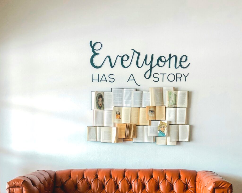
Coming up with an idea, drawing it, and simply posting it without a story can make a piece of art less significant, or make it quickly fade in someone’s memory (or the internet!). Let us look at an example:
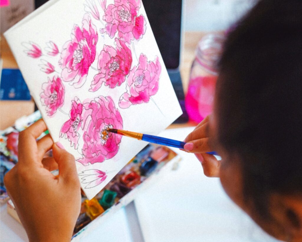
You create a floral pattern. You upload it on your socials without a story behind it and maybe it gets some engagement. But imagine that you add a story.
Now, if you upload the same art and share with your audience that the flower in the pattern was inspired by your childhood blanket — that adds some personal connection. People can be inspired or even feel the sentiment behind your piece of art and might likely appreciate how you made a complete pattern with something sentimental.

Not everything you make could be inspired by something sentimental — it could be silly, funny, or even serious. In my opinion, every piece of art is inspired by something that can give you a story to tell. You can share it in the caption, stories, videos, blog, or even mention it in your portfolio! Adding a story to the otherwise static art gives it some weight and helps in getting better engagement.
2. Combine two or more inspiration sources
When we are out of ideas for our art, we go hunting for inspiration. While we don’t want to copy someone else’s work entirely, we can efficiently make better art by studying another artist’s creations more deeply. This is one way of improving your skill because you are combining and coming up with something unique out of already existing works of art. There’s no harm in seeking outside inspiration because nothing in this world is original!
I usually go to Pinterest and search for art related to what I want to create. The key thing is not to look at just one artwork but two or more. Combining one element from different pieces of art can help you brainstorm something entirely new.
This method of combining multiple inspirations can help you stay away from unintentionally copying someone’s idea. Better yet, it brushes up your thinking skills. I have done this many times and trust me, it works wonders. I may reference a color palette, the texturing style, or a pattern tiling format from different artists and combine it all into my new piece of art!
Related Article: How to Expand an Illustration into a Mini Collection
3. Use textures to increase depth
Many designers create flat illustrations which is a stylistic choice. But using textures in your illustrations gives them extra personality, adds depth, and aids your art’s story. There are many texture brushes available for free or sold by artists on design marketplaces.
Two examples of texture you can add are shadows and highlights. Let’s say you’re making a flower motif for your pattern. You can take a darker hue with your texture brush and add shadows to deeper corners of the petals and a lighter hue at places to make the flower shine.

You can also use ‘add’ or ‘multiply’ blend modes to make the effect of shadows and highlights even more impactful. Texture brushes are so versatile that you need to sit and experiment with how various brushes can get you diverse effects in your art. Depending on your art style, either subtle textures or heavy textures could be your thing!
4. Add supporting elements
Supporting elements are just little illustrations that can be added to bring together the composition of your art. It’s like sprinkles. They can be small in size but have a huge impact on the cake!
In almost all of my illustrations, I add supporting elements like tiny dots and sparkles around my main subject in the illustration. They’ve become part of my signature style!
These elements can elevate your art in a few ways. Firstly, it can add character. Secondly, since they’re smaller than the main subject of your illustration, they add a variety of proportions to your art so that all your subjects look balanced.
Thirdly, it can just be for fun! Maybe wavy lines could make your piece come together, or stars… the possibilities are endless! Unless you’re making a symmetrical illustration, these elements can be used as fillers to fix imbalanced compositions or negative spaces in your work.
5. Make different color versions
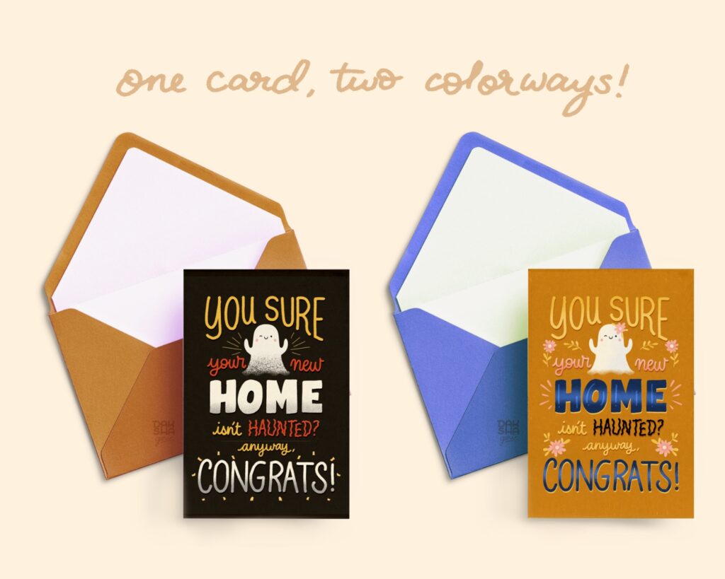
Even though you may have selected a preferred color palette for your artwork, how fun would it be to see the same set of motifs in a different colorway? Colors can heavily influence the mood of your artwork. Just as bright, warm colors make art look fresh and inspiring, dark tones can make the same art look moody.
This experimentation method can benefit you in a few ways. By providing different colors, you let a potential client have more chances and options to license your patterns that fit their brand! More colors = more inclusivity.

Secondly, different color palettes can bring out something new in your art that you wouldn’t otherwise see. Whatever art you choose to license, keep in mind that some customers prefer light pieces of art while others may like dark tones.
The color variations can broaden your licensing opportunities to multiple brands at the same time too. Different colors give a single piece of art many lives. I have many greeting cards licensed to two companies at once with just a color change.
All in all, you can easily apply these five ways to your own practice right now! By choosing one or all of the them, you can effectively make a difference in your surface design illustrations. You and your art deserve to be recognized by more people in the world!

Written by Daksha Giri
Website: www.dakshagiri.com
Instagram: @dakshagiri
Daksha Giri is an illustrator and lettering artist based in India who creates beautiful and unique artwork that is both visually appealing and emotionally resonant. Her work is seen in greeting cards, packaging, giftware & home décor.