
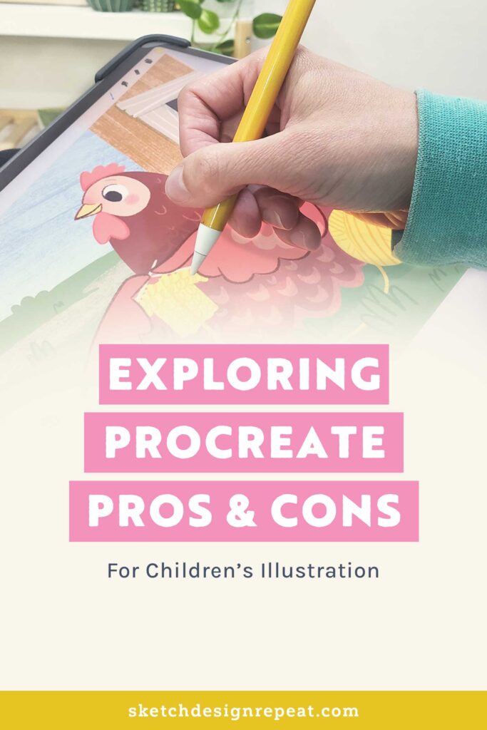
Becoming an illustrator is a rewarding journey. You may be used to traditional media, but you might’ve thought about trying out digital painting. With all the programs out there, it can be overwhelming, which is why I wanted to share my experience with Procreate as a tool to create professional illustrations for books and licensing.
I’m a professional children’s book author and illustrator, who does licensing on the side. I’ve been using Procreate for over eight years, and it’s what I use for most of my work now.
While I think Photoshop is the most used program, and the industry standard, I think Procreate is a strong contender in digital drawing programs. It has a lot to offer, especially for illustrators who are just starting to dip their toe in the industry. In this article I’ll share pros and cons of working in Procreate, how I work around the cons, and some differences in Procreate vs. Photoshop, that relate to the way I illustrate.
Initial Investment
While purchasing an iPad and an Apple pencil is expensive, I also think purchasing a computer with a lot of memory to work a graphics program and a Wacom or other drawing tablet can be expensive too.
Purchasing an iPad versus a computer and a drawing tablet is a whole topic in itself. The decision is personal and can depend on many things, like your drawing style, experience level, lifestyle, and budget.
Today we are focusing on just the Procreate app, which, if you already own an iPad and the Apple pencil, (currently) costs a one-time fee of $12.99 in the App Store. As an advantage, if you already own an iPad, the cost to operate Procreate is a lot cheaper than Photoshop (where the cheapest monthly subscription starts at $19.99/month).
Pros
Mobility
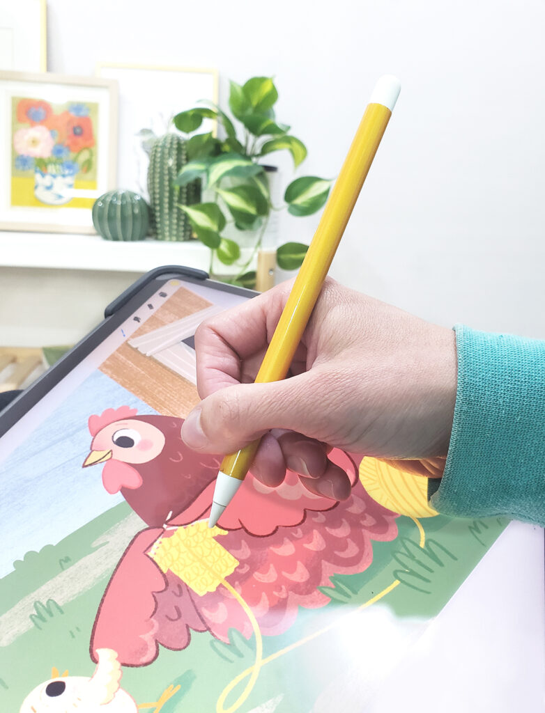
One of the biggest pros of using Procreate on the iPad is the mobility it offers. Untethered to a desktop computer and a large drawing tablet, I can work anywhere. As a mom of three, I love the flexibility to create where I can. I have spent countless hours sitting in a chair in the kids’ dark bedroom putting them to sleep. I wouldn’t be able to draw in a sketchbook, but I can bring my iPad, and draw in the dark or work on writing stories.
Comfort
Related to the point above, when I’m working on book projects that have me drawing for several hours a day for weeks, location-freedom also means less pain. When I’m drawing on my desktop computer, I start feeling it in my shoulders on the second day. When drawing on my iPad, I can change locations and positions a few times a day, and don’t have to deal with pain.
Pro Tip: As an extra work surface I do use a Sketchboard Pro. It helps position my iPad more ergonomically and lets my arm and hand rest next to my iPad more comfortably. You don’t need one when just starting out, and one would be pretty easy to craft yourself, but when you start working longer hours on your iPad, it is really a lifesaver.
Helpful Features
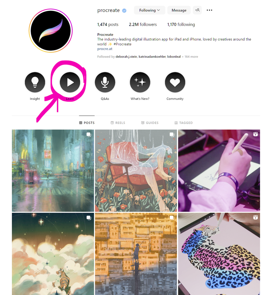
Procreate offers a lot of great features, like layers, masks, and layer blending modes, that make it easy and fast to create illustrations. If you have never used digital drawing programs before, it can seem daunting, but the same applies to all other drawing programs out there. I found that learning the basics was very intuitive, and then following online tutorials was a great way to pick up new, more advanced tips. Procreate has a really great Instagram feed, where they share lots of mini tutorials. Click on the learn button for all the quick tips. If you are looking for all the information in one place, Procreate has an online manual and tutorials on their website.
Brushes
Procreate comes with a lot of nice brushes already loaded. The brushes are also easy to edit, copy, move around, and group together, making it easy to grab and edit your favorite brushes from different sets and make a customized set that makes working in it fast and effortless.
You can also use any brush as a smudge tool or eraser. This is one of my favorite features! I can use all my favorite brushes in my custom picked set as erasers, creating texture and lively edges easily. Paired with masks, you can create some nice depth and textures in paintings.
Workflow
Another benefit of using Procreate is drawing directly on the screen. I love the directness of drawing on my iPad, no extra devices or cords needed. It’s so much easier than drawing on a tablet on the table that translates to the screen above. With Procreate, it’s so easy to go from initial sketch, straight to final art, without having to transfer anything from a sketchbook to digital or to a canvas or paper.
Adding Text
As a picture book creator, it’s important to be able to add text with my illustrations so I can visualize how the final pages will look. Text is easy to add in Procreate, and the text editing features make it fast to adjust font type, color, size, etc.
Animations
Procreate makes it super easy to create little animations or gifs of your illustrations. I love using them for promotions, and videos I create.
File Types
Last, Procreate makes it really easy to export illustrations in multiple file types. I can export image files like jpg, png, and Photoshop psd. Or if I’m making book dummies, I can gather all my illustrations for different pages and create a multi-page pdf of them. I can export animations as moving gifs or mp4 video files. (There are other options as well, but these are what I most often use.)
Cons
Blurry Images
One of my biggest issues with Procreate is that images get blurry when you move them around a lot or rotate them. To work with this drawback, I usually do one of three things:
a) I work everything out in the sketch phase, so when I get to final illustrations, I don’t have to move things around much anymore.
b) If I’m working on a pattern with lots of little pieces, I might duplicate the whole canvas and then move things as much as I want on the second canvas. When I have worked things out, I hit “copy all” (which copies all the layers on the canvas and combines them to one image), and then paste that to the top of my original canvas, set the opacity down to 30% or so it’s only slightly visible, and then move items below it to match.
c) Or last, I make copies of the object layers that I’m not sure of the placement/size and hide the original ones. Then move things around in the copied layers where I want them to be, and then when happy, make the original layers visible and move them to the correct places.
Learning Curve
It took a while to really get comfortable with the program. For a long time, I was trying to use Procreate and make my illustrations look like my traditional media pieces, but I never got results that I was happy with. Once I gave that up, and just went with what felt and looked good, I became much happier with the quality of work I was putting out.
Related Article: Planning Your Surface Pattern Designs
Using Procreate
Layer Limits
Procreate limits your layers when working on large files. The larger your canvas is, the less layers you can have. If I run out of layers in the middle of working with a piece, I will either look at merging masks or adjustment layers, and if that’s not possible, I duplicate my canvas, and merge layers on the second canvas to work more. If I need to change anything in the original layers, I can do that on the original canvas, and copy my change over to the second canvas.
Uneven Lines
Even with a paper-like screen protector, my lines sometimes just get wavy because of the slippery surface of the iPad. In my custom brush set, that includes about 10 of my favorite brushes, I have two copies of my liner brushes. One that has the streamline adjustment turned up and one is the original setting. It’s easy for me to toggle between the two brushes when outlining art. I use the streamlined brush for wide curves and smooth outlines and then the regular brush for all the details, grass, and fluffy bits where I need more movement and texture.
Color Space
Procreate used to only have an RGB option, which is how I’m used to working in it. They now offer a CMYK working space, which can be adjusted from the Actions menu (Actions > Canvas > Information > Color profile). I’ve heard mixed reviews of this feature and have continued to create work in the RGB default color space. But because most of what I do is intended to print, I need to be aware of what colors can be printed at standard printers using the more limited CMYK colors.
My solution to check colors before starting any final illustrations is to import my canvas with the palette shown into Photoshop, convert it to CMYK from the Convert to Profile option (Edit > Convert to profile) and check my colors. My favorite ICC profile to convert from RGB into CMYK is the “Working CMYK U.S. Web Coated (SWOP) v2,” which is a standard profile already in Photoshop.
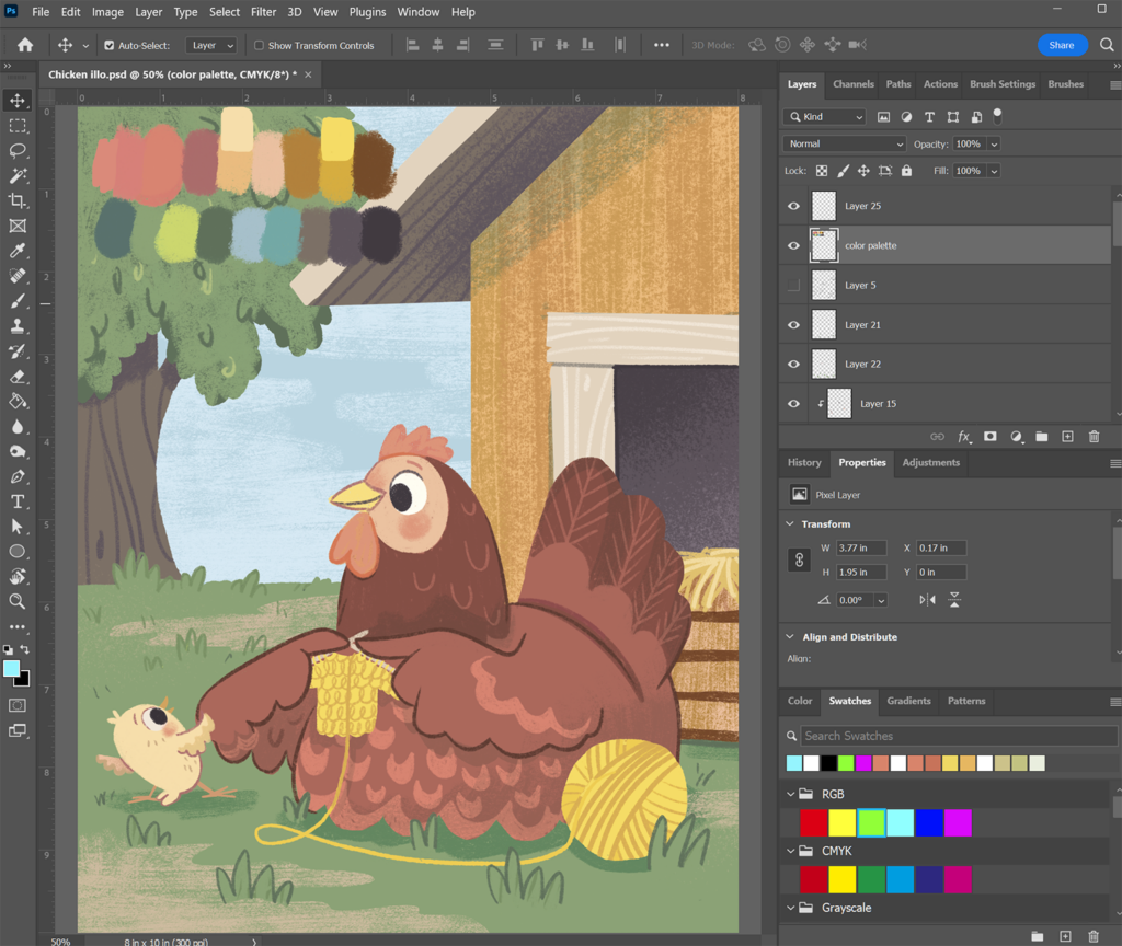
Sometimes colors turn less saturated in CMYK, and my illustration loses some of the visual contrast it had in RGB, so it’s a good time to adjust my palette, before getting any further in the project, and then export it back into Procreate.
There are many online converters of RGB to CMYK, but you can’t always trust how they convert images, and different papers and printers will have different kinds of profiles for how colors come out. Since Photoshop is an industry standard, it’s my preferred way of checking colors, but if you are only working in Procreate, the best thing would be to print a sample and see how things print. If you are unable to do that, you can ask your client to change your image into CMYK with the profile that their printer uses, and then use that image to adjust colors if needed. In general, the rule of thumb is that bright saturated oranges, greens, and light greenish blues don’t really translate well to print, so when picking colors, it’s better to steer clear of them, and pick more muted colors in those hues.
If you don’t have access to Photoshop, as another workaround, you can download GIMP, which is a free drawing program. Make sure you have the CMYK separation plugin for GIMP. Then download the ICC profile that you want to use. In GIMP, with the file open, right click on the image and choose Separate and then from there choose the profile that you want to use.
Overall, I love using Procreate! It’s literally changed my life. It helps my productivity as a mom of three: I can draw anywhere, at any time, and it keeps me pain free. I’ve shared my experience as it relates to book illustration, but there are so many great ways to use it for other kinds of illustration, like patterns and hand lettering. If you’ve been on the fence, I hope my article helped you decide to give it a try!
Written by Mirka Hokkanen
Website: www.mirkah.com
Instagram: @mirkadraws
Mirka is a Finnish-American author, illustrator & printmaker who finds inspiration from her Scandinavian roots, retro designs and nature. She creates books for children, and also licenses her work and sells on Etsy. She loves to share her knowledge on Skillshare and YouTube.


I totally agree! Procreate has changed my life too. Since I started using the app 2017 I’ve illustrated 10 children’s books on my iPad and I do all other illustrations there too. I doubt that I’ll ever go back to my old fashioned work process with sketching with pencils, then drawing with ink, colouring with watercolours, scanning and putting it all together in Photoshop. I can do all that in Procreate. One thing you didn’t mention but was a game changer for me is getting a paperlike screen shield so that it feels like drawing on paper.
Thanks so much for your info. I got into illustration trouble with the line decay. I was so used to zooming and rotating while working that I feared I needed to change to a different vector format program. But so far I am so uncomfortable with vector-can’t duplicate my own style. No wonder so much current illustration has that same look. I am so very grateful for your go-arounds, and you’re addressing the problem as real.
Thanks for this, Mirka. Very helpful, especially the color space issue.