For your clients and customers, having a good variety of greeting card designs helps you to successfully get paid for your art, as well as showcase your potential as a card designer. Over the past three years as a greeting card designer, I have had the chance to learn from my mistakes, my successes, and other artists. The portfolio tips below can be easily accommodated to your unique art practice, so here are six key ways to build a strong greeting card portfolio.

1. Showcase designs that really represent you
As artists, we need to visually represent ourselves with work that fits within our artistic bandwidth and interests. Oftentimes, we make mistakes by adding art pieces to our portfolio that were just casual explorations, trials, or forced creations. They might not be the work that we like or made thoughtfully.
It can be tempting to share all the work you create. But remember, you never know which client is browsing your work and making decisions based on what you have showcased in your portfolio. The work you show sets an expectation that you are capable of making that particular type of art in the long run. It also gives the impression that you’re good at making that kind of art.
For example: a majority of your cards include cursive typography but one day you just tried block lettering (which isn’t your core interest), but you wanted to show on your portfolio that you tried something new. While there’s nothing wrong with trying something new, is it representative of your brand?

To simplify, ask yourself whether the art you show in your portfolio is something you wouldn’t mind creating again and again. Is it the art that represents who you are, and what your vibe is? I remember one time I put up a design I made in a hurry that wasn’t usual for my art style, just for the sake of adding pieces to my portfolio. I was attached to what I made, but when I reflected on the design, that card was something I made one random day for a Father’s Day submission. Look at your current cards and sift through what is ‘you’ and what might not be!
Related Article: Design Greeting Cards That Stand Out
2. Include more everyday categories
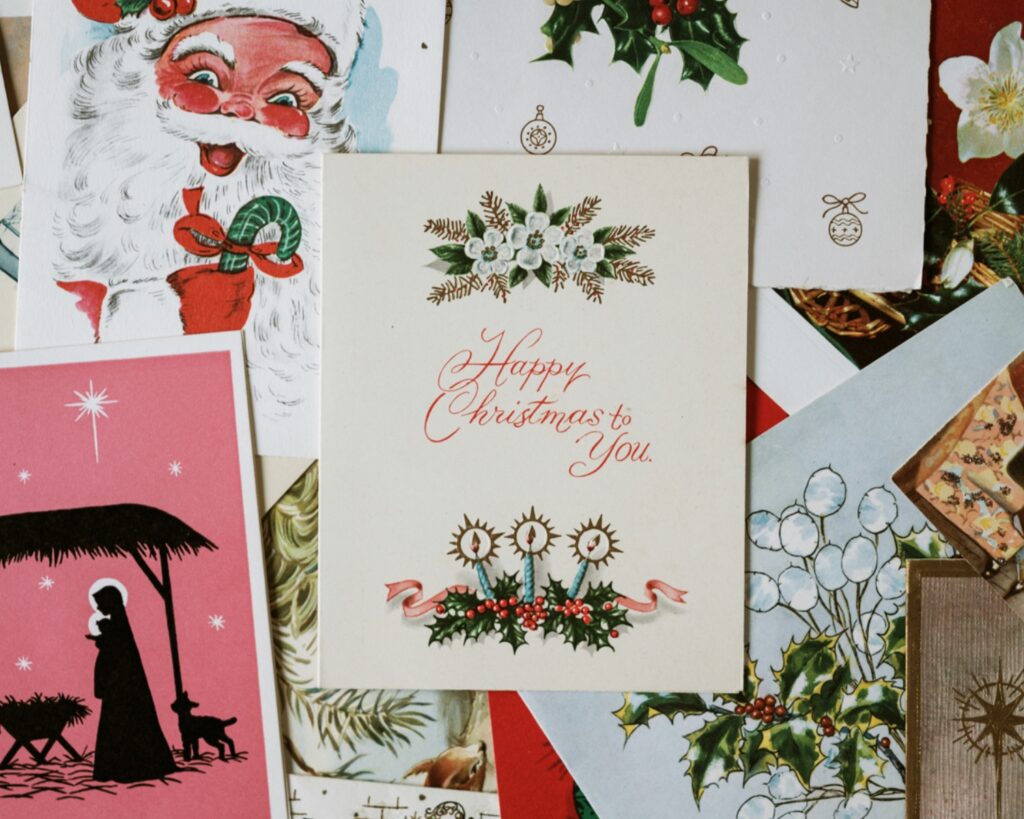
Greeting card occasions can be broadly divided into two categories, everyday and seasonal. Seasonal cards are something that sells only for a particular time of the year, I.e. Mother’s Day, Christmas, Diwali, St, Patrick’s Day, etc. On the contrary, everyday cards are sold all year round, I.e. Birthday, get well soon, wedding, new Baby, etc. These cards are evergreen and they can usually bring in consistent sales for you as a greeting card designer.
Why do I suggest having more everyday categories in your portfolio? Your design has more chances of being picked up for licensing because companies are always looking out for everyday cards. Whereas if you approach them with only seasonal cards, chances are that they might not need the design as of now, for a while.
Don’t get me wrong, presenting both card categories will one day or another help you become a licensed artist, however, everyday cards sell more and are required more by customers since they don’t have a set period of peak sales.

Given that they sell all year round, the competition is a lot too, because every artist needs consistent sales. Hence, when you create an everyday card, make sure it’s not generic but is different and unique with your spin on it.
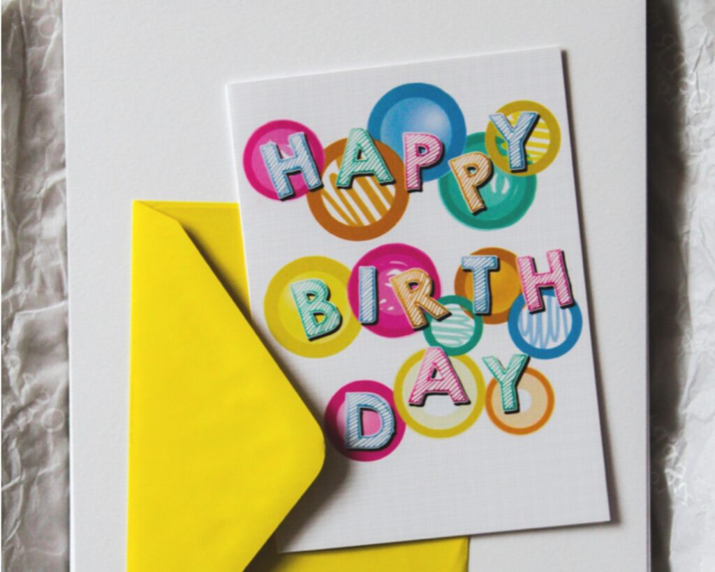
The market has a lot of ‘happy birthday’ cards but if you take the same occasion and create something out of the box, you will stand out no matter what. I’d say, have a 60–40 ratio between every day and seasonal designs. Even though seasonal cards might spike your sales due to a niche demand, everyday cards will get you sustainable sales all year round!
3. Remember the niche categories
As I mentioned in the previous point regarding the ratio of the card categories, the seasonal or ‘niche’ cards shouldn’t be neglected altogether. Even though they don’t sell all year round, it’s best to make good use of the limited period with a good design. In my experience, Valentine’s Day and Mother’s Day drive a lot of sales for me. Since my style leans more towards feminine and floral elements, I choose to focus more on those two occasions. Likewise, other popular card categories like Christmas, Thanksgiving, Graduation, New Year’s, etc. might do that for you. It’s a matter of experimenting with every card category and finding out what works best for your art.

But what will you do after the occasion is over? My hot tip would be to simply repurpose the design for another occasion! Play with the words, colors, and illustration elements. For instance, can your floral Mother’s Day card become a birthday card? Go for it! Usually, card companies are okay with licensing cards that have been licensed elsewhere; they only look for a point of difference. This can help your art be repurposed to its maximum potential. This tip is handy when you require a fresh design but don’t have the mood or time to make a new card!
4. Make designs with and without words
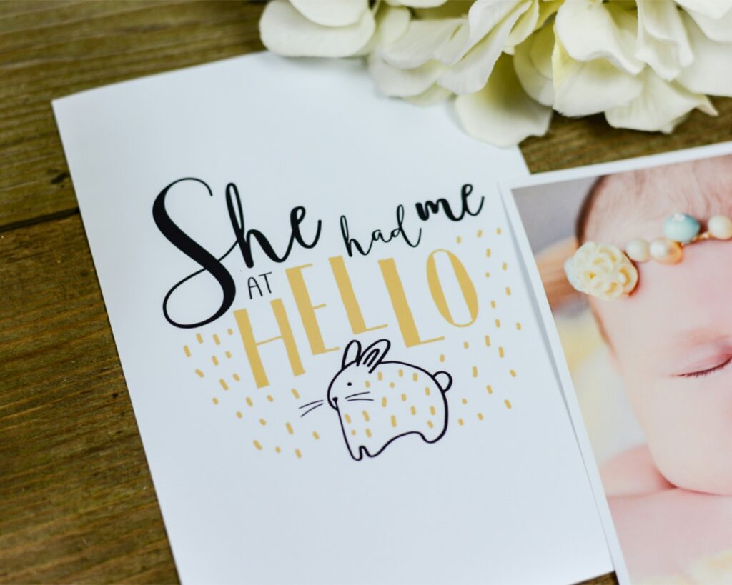
While there is an undoubted expectation for greeting cards to have a message on them, blank cards (i.e. cards without words) have a demand as well. Cards with words are widely sold and are sort of a norm in the industry because you’re usually expressing a sentiment when you send someone a card. Good lettering or typography paired with an emotion-provoking illustration can make a greeting card appealing. But what about cards without words?

Blank cards have only illustrations and no words on them. Christmas trees, floral bouquets, and abstract patterns are some examples of blank card motifs. In my experience, the most popular motifs are flowers. Florals sell well because they’re a universal symbol of gift-giving.
Customers can purchase a blank card and write anything inside, whether it be ‘get well soon,’ ‘thinking of you’ or even a ‘Happy birthday!’. Blank cards allow consumers to customize the inside of the greeting card in any way because the outside motif doesn’t represent any particular occasion. Blank cards are for consumers who may not prefer bold, silly designs but prefer a simple something with just an illustration. It is a niche category but one to look out for! My best tip to create blank cards is to repurpose existing illustrations of yours that you may have created for Instagram or just for fun!

5. Experiment with tones
As people, we have different ways of expressing our feelings. Some prefer sarcastically while others may prefer a cherishing way. This is why your portfolio needs to reflect cards with different tones. Have a variety of cards that range in tones such as funny, sarcastic, cheerful, heartfelt, naughty, sincere, etc. You need not tap into all of them at once, but experiment with each tone.
For me, funny and heartfelt cards sell the best. I tried selling sarcastic cards, but they didn’t do well for me. Likewise, you can tap into one or two tonal ideas mentioned above and see what works best for you! This way, you don’t miss out on a wider target audience.
If you feel confused, research and study other cards online with a similar style to yours and see what recurring tonalities appear. When you visit online marketplaces, you will get an idea of the best-selling card designs, which can be applied to your practice as well. But do not copy the ideas as is, make them your own or simply use them as inspiration. We don’t want to copy cards, even if we are just learning!

6. Keep your portfolio up to date
Now that you have some foundation laid out, you can start designing cards as and when you’re able. Keep in mind to update your portfolio in an efficient timeline. I’d say every 6–8 months, keep adding newer cards and remove older cards from your portfolio to keep it fresh. Of course, you can adjust the timeline as per your art career, but this is what works for me.
If you get an exciting project days after you update your portfolio, don’t shy away from posting it right away! Concerning my first tip, showing designs that represent you is really important. Don’t keep older designs from which you might have grown out of as an artist.
In case you forget to update, set a future calendar date for yourself so that you remember to stay on top of your game! Lastly, take a good day or one week to properly update your portfolio, because it is very likely to be representative of you for the next few months. Make sure you take your time so that potential and existing clients can see the best of your work that reflects your greeting card skills!
To conclude, these six tips are starting points for you to have fun and create more greeting card designs that align you towards what you truly desire to sell.
Remember, that as greeting card designers, we get to be a part of someone’s life as sweet little moments, so make sure your card portfolio reflects that!

Written by Daksha Giri
Website: www.dakshagiri.com
Instagram: @dakshagiri
Daksha Giri is an illustrator and lettering artist based in India who creates beautiful and unique artwork that is both visually appealing and emotionally resonant. Her work is seen in greeting cards, packaging, giftware & home décor.