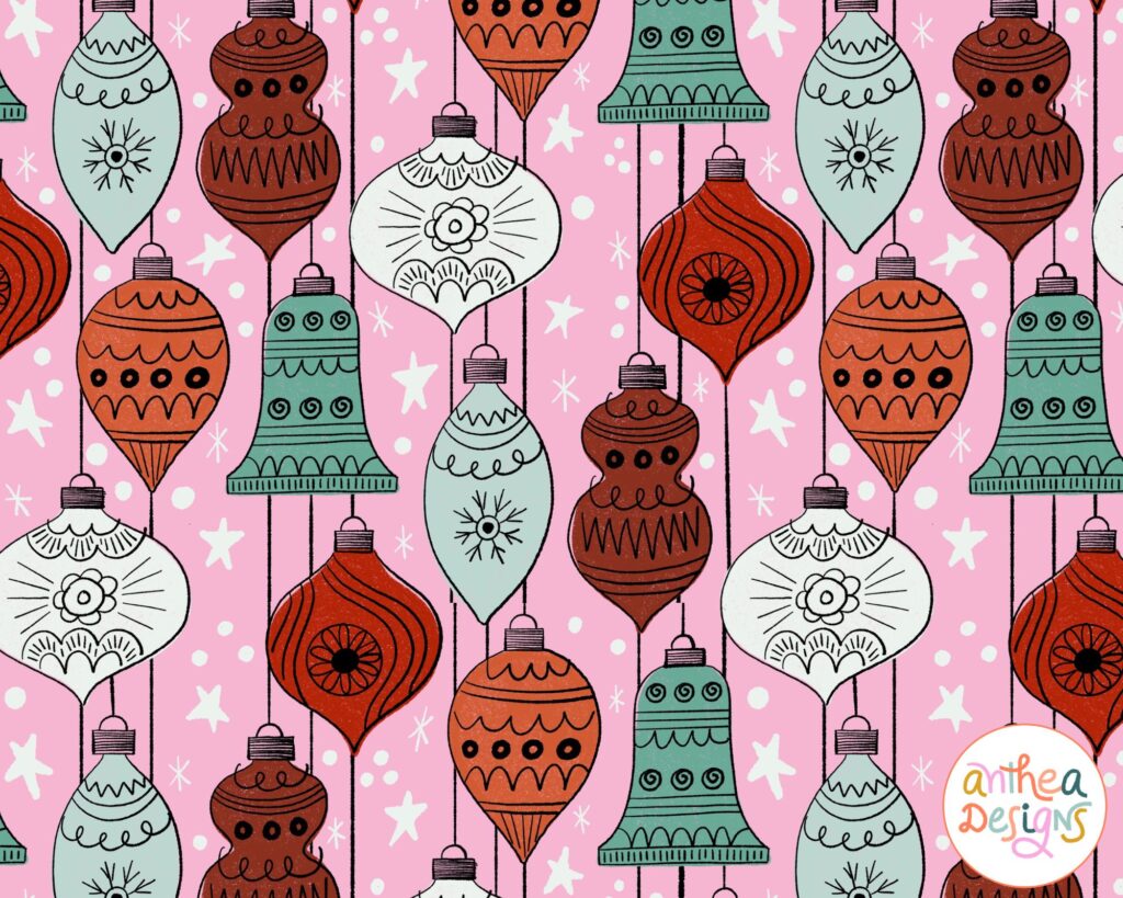
Ask any seasoned surface pattern designer or art licensing agent what themes sell year-round, and Christmas will be at the top of the list.
The holidays hold special significance for many people across the world. They aren’t just about fairy lights and decorating a Christmas tree. Christmas is about tradition, nostalgia, and getting together with family and friends. It is, rightly called, the season of giving.

When creating holiday-themed patterns and illustrations, give some thought to how you can give them a marketable edge. In this article, we’ll talk about analyzing your target industries, adding your unique flair to traditional Christmas themes, choosing your colors, and making your designs work for multiple products.
Understand Your Target Market
To create art that appeals to people who cherish the season, it is important to understand your target market. Now, what exactly do I mean by target market?
If you’re looking to license your art, it could be the clients or industries you’re planning to submit your art to. If you sell your own products, the target market would be your direct customers. In short, the target market or audience is the end user of your designs.
Ask yourself the following questions before you even sit down to plan your Christmas art.
What kind of holiday art does my target audience like?
Do they like classic designs with vintage charm, or do they prefer bold and modern motifs that represent contemporary celebrations? Understanding your audience can help give you a sense of the direction you need to take for creating your holiday art.

Who are you designing for?
I might sound like a marketing professional (well, we are talking about marketability here) but it’s crucial to think about the demographics of your target market. Are you designing for kids, teens, or adults? Where is your audience located? What cultural aspects do you need to consider?
For example, my efforts on creating a whole lot of Christmas art would be a waste of time if I was pitching to Indian companies.
What’s trending?
Christmas is an evergreen theme, but it’s always a good idea to keep your eyes peeled for what sells and what doesn’t during the holiday season. Trend research can seem daunting to many (including myself), so if you’re like me, start simple. Look out for emerging motifs and popular color palettes and then use them in your style.
Incorporate Seasonal Themes and Colors
While we’re discussing trends, it’s important not to forget about tradition. Certain colors, motifs, and themes have retained their popularity over the years and for good reason. Even if you’re considering focusing on a trendy theme and color story at the moment, it’s a good idea to have at least a few designs depicting traditional scenes in classic colors.

Conventional Motifs and Colors to Include in Your Designs
What comes to mind when you think of Christmas? What do you see on greeting cards or wrapping paper when you step into a stationery store? Think Santa, ornaments, Christmas trees, snowflakes, holly, reindeer, and gifts. These are timeless motifs that can serve as a starting point when you’re working on your Christmas collections.
As for colors, nothing can beat the appeal of rich shades of red, green, and metallic accents. Other popular choices include calm blues, blush pink, black, white, and jewel tones.
If you’re worried about your designs looking run-of-the-mill, take inspiration from vintage images and add your own twist by including unexpected pops of color or incorporating modern motifs that capture the heart of the holidays. Consider the emotions you want to evoke and choose your colors and themes accordingly.
Add Your Own Personality
Everyone’s drawing the same old Santa — so how do you stand out from the crowd? Just because certain themes have been in the picture for ages, it doesn’t mean that you can’t stray from the norm. Think about how you can draw these long-established motifs in your unique style.
Draw inspiration from your personal experiences, your culture, and your family traditions. Tell your own story, think about unexpected pairings of themes, and play around with colors and media. Spend some time brainstorming and making a long list of motifs you can use and contemplate how you can infuse your perspective to create authentic designs that are totally you.
Related Article: Hand Lettering for Beginners: Mistakes to Avoid
Create Versatile Designs
I know a lot of you think about the end product while designing your patterns and illustrations. I like to think about a variety of such end products so as to not limit my licensing possibilities.
While it’s great that you want to pitch to a greeting card company, and you set out to design accordingly, it can be helpful (and a bit freeing, if I may say so) to think about what else the illustrations could be used for.
Can a certain motif be used for stickers or a coffee mug? Can the pattern you’re creating for fabric be used on wrapping paper or a tea towel? As you widen your horizons before you start creating, you incorporate more structure into your planning phase and then the rest of your process plays out smoothly.
Creating versatile designs right from the get-go opens up a world of possibilities.
I enjoy creating art that can easily transition across different products. Add a few illustrations to your pattern collection. Consider throwing in some hand lettering if you’re comfortable. Work on a large scale if you can and always work in layers.
Focus on Presentation
Once you’ve created all that gorgeous art, how are you going to get it out into the world? Packaging your hard work is as important as making the art in the first place and deserves an equal amount of time and effort.
Mock-ups
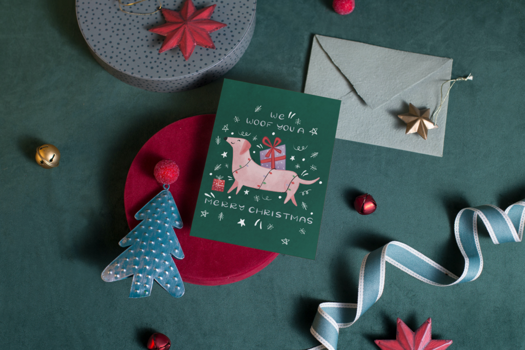
Personally, I avoid mock-ups because I’m not very good at them and I don’t really have one single end product in mind. However, if you plan ahead and have time on hand, you could leverage the power of mock-ups to showcase your Christmas art. If you’re pitching to a home decor company, consider mocking up your design on a cushion cover or napkins.
If you’re submitting your art to a fabric company, use a quilt mock-up. If you’re good at using Adobe Photoshop, you can use appropriate copyright-free images from a site like Unsplash. You can also purchase mock-ups from independent designers, photographers, or from a marketplace like Creative Market.

Lookbooks
A lookbook is a digital portfolio of sorts that is mostly used to showcase a single collection or a few smaller ones together. This is a popular choice amongst artists who create large pattern collections. You can add your bio, your collection story, a wide range of mockups, product photographs, and interactive links.
Portfolio Sheets
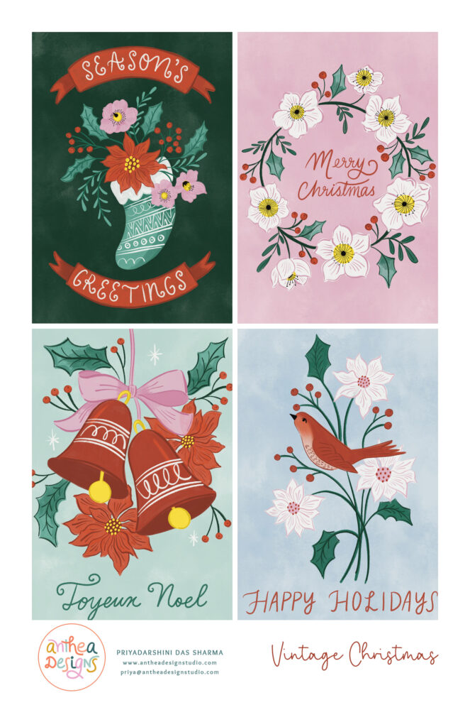
Often called sell sheets, portfolio sheets are a smart, concise way of showing off multiple designs in a collection. You could add mock-ups and color palettes, if you want, but it’s always a best practice to stick to what’s absolutely essential — your art.
Steer clear of clutter if you can; most art directors prefer seeing your designs and nothing else. Having a clean portfolio sheet can also reduce your workload and you can send the same sheet to companies across different industries.
Tips for Creating Portfolio Sheets:
- Include your name and contact information
- Break down larger collections into two or more sheets
- Save your files as low-res JPEGs
- Organize them according to themes
Don’t want to build your portfolio sheets from scratch? Use SDR’s Portfolio Sheet Template Suite – they were built based on Shannon’s own portfolio sheets.

Having multiple pieces of holiday art in your portfolio is a great way to increase your licensing opportunities. Spend time planning and researching before you start working on each collection. The idea here is to create art that is adaptable for multiple products, resonates with your target audience, and incorporates current trends with evergreen ones.

Written by Priyadarshini Das Sharma
Website: www.thehappypost.com
Instagram: @antheadesignstudio
Priyadarshini is the founder of Anthea Designs and The Happy Post. She is passionate about art, organization, productivity, and mental health, and loves sharing her knowledge. When she’s not working on her next masterpiece, Priyadarshini loves spending time with her daughters and three rescue dogs.